Search This Blog

Wednesday, November 15, 2017

Sample Ielts Academic Writing Task 1-The Chart below gives information about global population percentages and distribution of wealth by region

The Chart below gives information about global population percentages and distribution of wealth by region.
Summarize the information by selecting and reporting the main features, and make comparisons where relevant.
Write at least 150 words

The given bar graph elucidates comparable figures about distribution of wealth and population in different regions of the world.

Regions like North America, Europe and Rich Asia-Pacific hold most of the wealth of the world, while the number of inhabitants in these areas is quite low. North America accounts for almost 35% of total wealth followed by Europe, 30%, and Japan, 24%, while population is merely 7%, 15% and 5% respectively.

On the other hand, regions, like China, Other Asia Pacific, India, Africa, and Latin America house a majority of population, with China having 27%, followed by Pacific and India, 16%, Africa, 10% and Latin America and Carribean, 7%. But, in contrast, the amount of wealth in these parts of the world is well under 5% individually.


Quite strikingly, where North America has less the 10% of total inhabitants  on the planet and 35% wealth, in countries like China and India 28% and 16% dwellers live, while their share of wealth is 3% and 1% respectively.

Wednesday, October 4, 2017

Sample Ielts Academic Writing Task 1- The bar chart and line graph below show the results of a survey conducted over a three-year period to discover what people who live in London think of the city
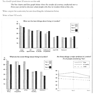
The bar chart and line graph below show the results of a survey conducted over a three-year period to discover what people who live in London think of the city.
Write a report for a university lecturer dscribing the information below.
Write at least 150 words  
The bar chart and line graph below show the results of a survey conducted over a three-year period to discover what people who live in London think of the city
Ielts Essay - The bar chart and line graph below show the results of a survey conducted over a three-year period to discover what people who live in London think of the city

The given graphs elucidate opinions about the best and the worst things that affected the quality of life in London over a three year period.

It can be clearly observed that variety of shops was to the most popular among Londoners followed by employment openings, ethnic mix, museums and galleries, and transport even though the positive opinions  about shopping options, employment  openings and racial mix witnessed a slight decline; and views about museums and galleries, night life and  transportation registered a slight improvement.

But, cost of living, traffic jams and crime were considered to be the weakest points for this city followed by prices of accommodation and  transportation. There was a great improvement about criminal activities, living costs, jams, and transport, while accommodation costs became an eye sore.

People's views about major issues faced in the city: littering, air pollution, noise, also improved despite littering registering a slight rise in the second year.


Quite strikingly, transport was a strong, as well as a weak point of life of London.

Monday, September 18, 2017

Sample Ielts Academic Writing Task 1 - The Graph and the bar chart below show the average monthly rainfall and temperature for one region of East Africa.
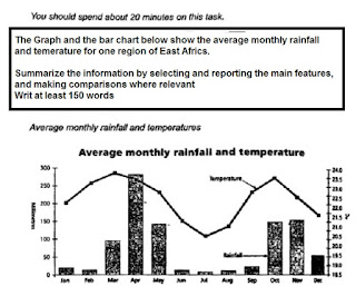
The Graph and the bar chart below show the average monthly rainfall and temperature for one region of East Africa.
Summarize the information by selecting and reporting the main features, and making comparisons where relevant
Writ at least 150 words

The Graph and the bar chart below show the average monthly rainfall and temerature for one region of East Africa.
Ielts Academic Writing task 1 - The Graph and the bar chart below show the average monthly rainfall and temerature for one region of East Africa.

The graph elucidates weather patterns in an East African region during a year.

Quite strikingly, it can be observed that patterns of rainfall and temperatures are almost identical. Even though variation in the rainfall is much greater than the temperatures all around the year, there are marked similarities in the rise and fall of both.

Where the variation in the rainfall varies from 10mm - January to 270 mm in April, the temperature varies from 20.5 degrees to 23.5 degrees, but it can be seen that rise in rainfall amount generally coincides with  simultaneous rise in the temperature - it rains when it is hot.

Similarly, as the precipitation hits lowest between June and August - below 10 mm with 2 mm in July,  weather also cools down in the corresponding period - 20.5 degrees in July.


Although both rise in later part of the year, the weather becomes hotter, rises back to 23.5 degrees, the rainfall registers much lesser rise, up to 150 mm. 

Friday, September 15, 2017

Sample Ielts Academic Writing Task 1 - The Diagrams below show stages in the development of simple cooking equipment. Summarize the information by selecting and reporting the main features, and make comparisons where relevant.

The Diagrams below show stages in the development of simple cooking equipment.
Summarize the information by selecting and reporting the main features, and make comparisons where relevant.
Write at least 150 words
The given diagrams elucidate stages in evolution of simple cooking apparatus.
 
The Diagrams below show stages in the development of simple cooking equipment. Summarize the information by selecting and reporting the main features, and make comparisons where relevant.
Ielts Writing Task 1 - 
The given diagrams elucidate stages in evolution of simple cooking apparatus in three stages.  

The primitive  design was very simple that made use of three stones arranged in a manner, triangular shape  to support the cooking vessel. The wood of fuel was simply lit under the vessel.

With the time, some improvements in the design were affected to make cooking easier. A clay shield was built around the three stones, and an opening was left for insertion of the fuel. As can be observed, this design aimed at protecting the fire, lit under the pot, from the winds. Rest of the design was almost similar.

The more advanced specimen, made of metal, used for cooking is completely different from its predecessors. This design has two portions, upper and lower chamber. While the upper chamber has a clay lining, handles to hold, three supports for the cooking pot, and a grate for holding charcoal, the lower part with a door is meant for inlet of air and disposal of ash.   


Wednesday, August 30, 2017

Sample Ielts Academic Writing Task 1 - The table below shows the results of surveys in 2000, 2005 and 2010 about one university

The table below shows the results of surveys in 2000, 2005 and 2010 about one university. Summarize the information by selecting and reporting the main features, and make comparisons where relevant.


Write at least 150 words
The table below shows the results of surveys in 2000, 2005 and 2010 about one university
Ielts Academic Writing Task 1 - The table below shows the results of surveys in 2000, 2005 and 2010 about one university

The table indicates changes in the attitudes of students towards various facilities at universities between 2000 and 2010.

Most striking observation is a significant rise in percentage of students rating about electronic resources in this period, it rose from 45% in 2000 to a whopping 88% in 2010, it was more steep in the first 5 years, touching 72% in 2005.

Similarly, there was an improvements in the opinions about teaching quality even though very limited, from  65 in 2000 to 69 ten years later though there was a slight decline in first 5 years.

In contrast, opinions about building and teaching facilities remained unchanged throughout the decade, 77%. Similarly,  although print resources, on an overall registered a one percent rise in positive views in the decade, it actually declined from 89% in 2005. But, still both these facilities continued to be overwhelmingly popular among the pupils.

However, range of modules offered registered a juicy decline of 5% in the 10 year period, it was steeper from 2005 to 2010.
    

Tuesday, August 29, 2017

Sample Ielts Academic Writing Task 1 - The Charts below show UK and USA energy consumption in 2000 and 2006 - II

The Charts below show UK and USA energy consumption in 2000 and 2006. Summarize the information by selecting and reporting the main features, and make comparisons where relevant.
Write at least 150 words

The Charts below show UK and USA energy consumption in 2000 and 2006

The given bar charts elucidate changes in energy consumption patterns in UK and the USA from 2000 to 2006.
It can be clearly observed that in 2000, pattern of reliance fuels for energy production in both the country was almost similar, as far as the reliance on various sources is concerned, though the percentage and amount varied a little. Both the countries heavily relied on oil and coal, the percentage of use of these materials was higher in the US, above 35% and 35% in comparison to above 25% and 30% respectively though gas atomic power and other renewable sources were used more in Britain.

From 2000 to 2006, the pattern of dependence on the fuels underwent a seas change. While UK shifted to use of gas, followed by oil - use of other renewable sources also saw a rise, in the USA oil continued to be widely used, followed by gas.

Quite notably use of coal decreased significantly, by approximately 10%. Similarly,  use of nuclear power also declined. 

Monday, May 22, 2017

Sample Ielts Academic Writing Task 1 - The pie charts below show responses by teachers of foreign languages in Britain to a survey concerning why their students are learning a foreign language

The pie charts below show responses by teachers of foreign languages in Britain to a survey concerning why their students are learning a foreign language. The first chart shows the main reasons for learning a foreign language.  The second chart shows how many teachers felt that there have been a recent change in the reason.
Write a report for university lecturer describing the information below.
Write at least 150 words
The pie charts below show responses by teachers of foreign languages in Britain to a survey concerning why their students are learning a foreign language
Sample Ielts Writing Task 1 - Pie Charts 

The given graphs depict the reasons why people learned a foreign language and views of the teachers about the variations in the causes as to why people went into learning a foreign language.
Most of the people studied a foreign language since they wanted to travel, 33%, followed by the ones who wished to carry out business activities in foreign countries. Nineteen percent of learners were interested in investing in real estate overseas, while an equal number of people, 7% each, wished to socialize and develop personality.  There were some, 6%, who started studying alien linguistic skills out of interest, while 3% wanted a foreign partner.

As far as changes in trend are concerned, teachers felt that intention of investing in overseas property led to a rise of 34%, while wish to do business caused a 19% rise. Similarly, inclination to socialize led to a rise of 15%, followed by general interest,6%,  foreign partner, 4%,  and travel, 3%. Fifteen percent teachers though felt that there was hardly any change
The pie charts below show responses by teachers of foreign languages in Britain to a survey concerning why their students are learning a foreign language. The first chart shows the main reasons for learning a foreign language.  The second chart shows how many teachers felt that there have been a recent change in the reason.
Write a report for university lecturer describing the information below.

Write at least 150 words

Sunday, May 21, 2017

IELTS academic writing Task 1 - Graph Sample 2 The Graphs below show the figures for population distribution in the northwest for 1900-2050

The Graphs below show the figures for population distribution in the northwest for 1900-2050.
Summarize the information by selecting and reporting the main features, and make comparisons where relevant.

Write at least 150 words. 

The given graphs elucidate the changes in distribution of population in the Northwest over a period of 100 years and projection for up to 2050.

At the start of the 20th century, almost 2/3rds of the population in the Northwest resided in rural regions, while a little less than 40% inhabitants lived in cities. Suburbs had barely 10% population.

By 1950, percentage of population in sub-urban areas had risen by 100%, to 20%, while villages witnessed a dip of 20%, the number of inhabitants in big cities remained somewhat same.

The latter half of the 20th century witnessed a spike in suburban populace, reaching 40%. At this point the number of people living in the suburbs reached at par with the percentage of inhabitants in big urban centers, while rural population dipped drastically to 20%.

By 2050, it is expected that outskirts of city would support more than half of the population of Northwest while villages would have barely 10% people. The urban population is expected to remain static.

Friday, May 5, 2017

Sample Ielts Academic Writing Task 1 - The three pie charts below show the changes in annual spending by a particular UK schoolIelts

The three pie charts below show the changes in annual spending by a particular UK school in 1981, 1991, and 2001.
Summarize the information by selecting and reporting the main features, and make comparisons where relevant.
Write at least 150 words.
 
The three pie charts below show the changes in annual spending by a particular UK school
Ielts Writing Task 1 - The three pie charts below show the changes in annual spending by a particular UK school

The given pie charts illustrate spending patterns on different items in a UK school in 1981, 1991 and 2001.

Expenditure on salaries – teachers and other staff – cumulatively formed the largest head of expenses, 60% in 2001, even though the quantum spent on wages of other workers declined continuously from 1981 to 2001, from 28% to 22%, and remuneration given to teaching staff rose from 40% to 50% between 81 and 91, but declined by 5% in next decade.

Ratio of money spent on resources, like books registered a rise of 5% from 81 to 91, but saw a substantial decline in the next decade – more than 50%, fell to 9%. However, the trend of expenses on furniture and equipment registered a completely reverse pattern. Spending on this head, although fell significantly from 15% to 5% between 81 and 91, registered a three-fold rise to 23% by 2001.

Insurance gained importance in the corresponding period, money spent on it rose from a partly 2% to 8%.  

Saturday, April 22, 2017

Sample Ielts Academic Writing Task 1 -The graph below shows how money was spent on different forms of entertainment over a five year period.

The graph below shows how money was spent on different forms of entertainment over a five year period.
Summarize the information by selecting and reporting the main features, and make comparisons where relevant.
Write at least 150 words

The graph below shows how money was spent on different forms of entertainment over a five year period.
Ielts Academic Writing task 1 - Graphs 

The given graph illustrates changes in spending on various modes of entertainment in three regions in 1995 and 2000.

Expenditure on entertaining was highest in the USA in both the years, rising from $184 billion to $257 billion though Europe and Asia too registered a rise of 34 billion, from 97 billion to 131 billion, and 43 billion, from 67 billion to 110 billion, respectively.

Quite striking fact was the similarity in percentage of money spent on various modes: television and publishing, were almost similar with parallel rise, were major areas where an overwhelming amount of money, above 70% even though 90% in case of the United States, was spent in all three regions.

Similarly, music also witnessed a two-fold rise, in spite of being moderate, in the US and Asian markets, but Europe on the other hand saw a rather stagnant market.


Video registered a 100% rise in all the three markets despite of quantum being quite limited, but the market of cinema remained stagnant.   

Friday, April 14, 2017

Sample Ielts Academic Writing Task 1 - The given chart shows the amount of money spent on fast food per week in Britain

The given chart shows the amount of money spent on fast food per week in Britain. The graph shows the trends in consumption of fast foods.
Write a report for a university lecturer describing the information given below.
You should write at least 150 words.

The given chart shows the amount of money spent on fast food per week in Britain
Ielts Sample Writing Task 1 - Graphs Hamburgers and Fast Food 

The given chart and graph depict preferences in fast food options among people from three different income groups in, and the changes in consumption of these fast food items between 1970 and 1990.

Elite class consumers spent significantly more than other income groups. The first choice of rich class was hamburgers, with an overwhelming consumption of more than 40 pence per capita per week, while pizza, and fish and chips came in a distant second third.

The middle income group also preferred hamburgers, 33 pence per individual per week followed by fish and chips, and hamburgers. The low income group chose fish and chips over rest of two other fast foods.


As per the graph, the consumption of fish and chips witnessed a steady decline from 1970 to 1990, from 300 grams consumption to almost 200 grams. However, the hamburgers and pizza gained favors as they registered a rise in the corresponding period though the rise of hamburger consumption was steep between 1980 and 1990, ultimately touching 500 grams.

Wednesday, April 12, 2017

Sample Ielts Academic Task 1 - The Chart and the table below show customer satisfaction levels in the US with airlines and aspects of air travel in 1999, 2000 and 2007.
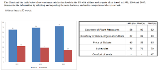
The Chart and the table below show customer satisfaction levels in the US with airlines and aspects of air travel in 1999, 2000 and 2007.
Summarize the information by selecting and reporting the main features, and make comparisons where relevant.
Sample ielts Acadeimic Writing Task 1

The given bar chart and table illustrate changes in the satisfaction level of airlines passengers in terms of various components in years 1999, 2000 and 2007.

The percentage of contended passengers in the quoted period registered an uninterrupted rise from 65% in 1999 to 72% in 2007 though the rise was drastic between 1999 and 2000, from 65% to 69%.

As far as various aspects of air travel was concerned, there was a rise in percentage of travelers who were happy with courtesy of flight attendants, touching 92% from 88% in corresponding period, and ticket pricing, significantly rising from 45% to 65%.

Almost similarly, a great percentage of people remained satisfied with the schedules of flights, rose from 75 to 79.   

A new component of air travel was also surveyed about in 2007, seat comfort, and 42% felt happy with this aspect.


However, in terms of services of check-in gate staff, lesser satisfaction levels were registered in 2007 in comparison to 2000, from 89 to 88%.

Friday, March 24, 2017

Sample Academic Writing Task 1 - The Table shows the numbers of visitors to Ashdown Museum during the year before and the year after it was refurbished.

The Table shows the numbers of visitors to Ashdown Museum during the year before and the year after it was refurbished. The charts show the result of surveys asking visitors how satisfied they were with their visit, during the same two periods.
Summarize the information by selecting and reporting the main features, and make comparisons where relevant.
Write at least 150 words
 
Ielts Sample Academic Writing Task 1 - Pie charts 
The given table and pie charts inform, and compare changes in number of visitors and opinions of visitors about Ashdown Museum before and after renovation.

The number of people paying visit to the museum rose substantially, from 74000 to 92000 within a matter of a year of renovation. It can be observed that there was a great change in the views people held about Ashdown.

A majority of people seemed to be dissatisfied, or dissatisfied with the museum, 55%.

The swings in opinions registered a significant transformation within 12 months of renovation. An overwhelming number of people visiting Ashdown seemed content, or very happy, percentage of content and extremely happy visitors rose by 10% in both cases, rising to 40% and 30% respectively.

Quite contrary to that, there was a staggering fall in the proportion of discontented people by a good 30%, from 40% to 15% and  highly discontented by half, from 10% to 5%.


There was no change in the ratio of visiting individuals choosing not to respond.

Friday, March 17, 2017

Sample Academic Writing Task 1 - The Graph and the table show the average monthly temperatures and annual hours of sunshine received by three major cities. Summarize the information by selecting and reporting the main features and make comparisons where relevant.

The Graph and the table show the average monthly temperatures and annual hours of sunshine received by three major cities.
Summarize the information by selecting and reporting the main features and make comparisons where relevant.
Write at least 150 words

The given graph and table compares average monthly temperature patterns of London, New York and Sydney, and the amount of sunshine received by these cities.

It can be observed clearly that London and New York have somewhat identical patterns of rise and fall of temperature annually. The temperatures in these cities tend to rise as the year advances and after the mid year, it becomes colder towards December though the variation in rise and fall in temperature in New York, from 5° to 30° and back, is more than London, where the change is more moderate, from 10° to 25° and back.

In contrast, Sydney experiences an inversely proportional, but a moderate trend. The temperatures tend to be higher in January 26°, and cooler, 15°, in July and again warm in December; the variations are moderate like London.


New York and Sydney receive almost similar amount of sunlight in a year while London received less than half of former cities despite New York receiving highest 2535 hours, and Sydney, 2473 hours.

Monday, March 13, 2017

Sample Academic Writing Task 1 - The graph below shows average carbon dioxide (CO2) emissions per person in the United Kingdom, Sweden, Italy and Portugal between 1967 and 2007. Ielts

The graph below shows average carbon dioxide (CO2) emissions per person in the United Kingdom, Sweden, Italy and Portugal between 1967 and 2007. 

Summarize the information by selecting and reporting the main features, and make comparisons where relevant.
Writ at least 150 words.

carbon dioxide (CO2) emissions
Ielts Academic Writing task 1 

The given graph illustrates changes in the annual per capita CO2 emissions in four countries between 1967 and 2007.

It can be observed that CO2emissions per person in Great Britain were highest in the 4 decades even though a fall of almost 4%, from approximately 11% to approximately 7%, was recorded in the quoted period.

Similarly, Sweden also registered a fall in the corresponding period, from around 9% to 5% , though it initially saw a spike of around 1.5% from 1967 to 1977. From 1977 onwards, the decline in emissions was drastic, and Sweden was surpassed by Italy in 1987. In 2007, carbon emission of this country was at par with Portugal.

On the other hand, Italy and Portugal witnessed a rise in the carbon discharge in the corresponding time frame. The pattern of rise in both the countries was almost identical even though the difference in emissions was more than 2% between Italy, above 4%, and Portugal, 1%.

The rise was constant in both the nations.


Monday, February 20, 2017

Sample Ielts Academic Writing Task 1 - The Charts below show UK and USA energy consumption in 2000 and 2006. Summarize the information by selecting and reporting the main features, and make comparisons where relevant. Summarize information by selecting and reporting the main features, and make comparisons where relevant. Write at least 150 words


The Charts below show UK and USA energy consumption in 2000 and 2006. Summarize the information by selecting and reporting the main features, and make comparisons where relevant.
Summarize information by selecting and reporting the main features, and make comparisons where relevant. 

Write at least 150 words


The given graphs illustrate changes in the use of energy resources in UK and the USA between 2000 and 2006.

In 2000, Britain and the US heavily relied on Oil and coal. While in the US, more than 70% energy was generated by Oil and coal, and rest of other sources accounted for barely 30%, distribution in UK was more even, since fossil fuels accounted for just above 50%, and others for about 42%. 

In the next six years, drastic changes were observed, as use of coal significantly dropped in both the countries, in UK consumption was almost halved, from 30% to 15%, while in US there was a drop of 10% in coal consumption.

Use of oil increased in the USA and UK, 40% and 30% respectively, dependence of USA on this source was heavy. In contrast, Britain became more adapted to use of Gas, as it accounted for highest used resource, 38%.

Use of other nonrenewable resources remained stable though used sparingly though nuclear power was used lesser.

Wednesday, January 25, 2017

Sample Ielts Academic Writing Task 1 - The graphs below show the number of drivers in Britain who have been caught driving too fast by speed cameras placed on roads.

The graphs below show the number of drivers in Britain who have been caught driving too fast by speed cameras placed on roads, and the number of people killed in road accidents, over an eight-year period since the introduction of speed cameras. The tables show the results of a survey of people’s opinion on the speed cameras.
Write a report for a university lecturer describing the information below.
Write at at least 150 words
Ielts Academic Writing Task 1

The given graphs and tables illustrate the impact of installation of speed cameras on road mishap casualties and the opinion of people regarding the usefulness, objectives and number of cameras respectively. 

It can be clearly observed from the graphs that installation of cameras has had little effect on the road casualties, though between the third and fourth year there was slight fall in number of accidents, even though the amount of fines collected with help of speed cameras rose eight folds in first 8 years after introduction, the amount of fines collected rose by 400,000 in first 5 years and then sharply climbed in next four years to 1,600,000.


Majority of respondents, 60%, did not seem to be convinced about the usefulness of the cameras in reducing road accidents. Similarly, an overwhelming number of respondents, 71%, felt that the primary objective of cameras was to merely raise revenue. More than half of individuals also felt that the number of installed cameras was more than required.