Search This Blog

Wednesday, December 30, 2020

Ielts Academic Writing Task 1 The diagram below shows how a mechanical arm works


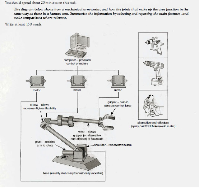
The diagram below shows how a mechanical arm works, and how the joints that make up the arm function in the same way as those in a human arm. Summarize the information by selecting and reporting the main features, and make comparisons where relevant


The diagram below shows how a mechanical arm works

The given diagram elucidates how a robotic arm works in a similar fashion to a human arm while performing tasks such as spray painting, drilling and welding. 


Overall, a mechanical arm is controlled by three computer monitored  motors and has joints similar to a human arm.  

 This arm is anchored to the foundation at the shoulder. This base is usually not moving, but sometimes it is movable. The movement of raising or lowering the arm is supported by the pivot installed between the shoulder and the base. This part also allows rotation of the whole arm, allowing it to work just like a human shoulder. 

The elbow in the middle allows free movement including flexing and rotating, affording complete flexibility to the whole equipment. Similarly,   the wrist of the mechanical arm functions just like a human counterpart allowing hand free movement, gripper  in this case. Gripper is equipped  with sensors to control force of hold. Gripper can be replaced by other end-effectors:  spray paint, drilling and welding metals.  


Wednesday, December 23, 2020

Ielts Academic Writing Task 1 Graphs The chart below shows information about changes in average house prices in five different cities


The chart below shows information about changes in average house prices in five different cities between 1990 and 2002 compared with average house prices in 1989.

Summarize the information by selecting and reporting the main features, and  make comparison where relevant.

Write at least 150 words

The chart below shows information about changes in average house prices in five different cities between 1990 and 2002 compared with average house prices in 1989


The given bar chart illustrates changes in the average prices of dwelling units between 1990 and 2002 based on the average prices of 1989.

Overall, the average mean prices of housing registered to the large fluctuations in London and New York while in Madrid, Tokyo and Frankfurt they remained largely in the same pattern.

In the period from 1990 to 1995 the prices of residential units in London and Tokyo registered the steepest fall of approximately -7%. This was followed by New York, -5%  in comparison to 1989 prices. However, Frankfurt and Madrid recorded a rise of nearly 3% and 2% respectively. 

Quite interestingly, in the period of 1996-2002 radical variations were witnessed in the case of London and New York where a dramatic rise of almost 11% and 5% respectively, was registered in relation to 1989. In contrast, in Tokyo the prices were 5% lesser in comparison to 1989 while Madrid and Frankfurt had almost 4% and 2% higher prices than the base year. 


Friday, December 18, 2020

Ielts Academic Writing Test Bar Graph The bar chart below shows the percentage of Australian men and women in different age groups who did regular physical activity in 2010


The bar chart below shows the percentage of Australian men and  women in different age groups who did regular physical activity in 2010.

Summarize the information by selecting and reporting the main features, and make comparisons where relevant.  

The bar chart below shows the percentage of Australian men and  women in different age groups who did regular physical activity in 2010


The given bar chart illustrates the participation of Australian men and women in regular physical regimes in different age groups, in 2010. 


Overall, age-wise patterns of both the genders were inversely proportional to each other, where lesser men undertook such activities as the age rose to a certain point, participation of women rose, but in 65 and over, both the genders had equal engagement. Similarly, the highest participation in males was in the youngest age group while among women it was at the peak in the oldest.


The highest participation among men was age group 15 to 24, 52.8%, but it plummeted  to 39.5% in 35 - 44 group though the fall was steeper upto 25-34, reaching 42.2%. After that the participation rose steadily to 46.7% in the oldest group. 


However, the participation among women peaked at 53.3% in the 45 - 54 age group after rising from 47.7%, the lowest, among the youngest group, it dropped to 47.1% in the oldest group.


Thursday, December 17, 2020

Ielts Academic Writing task 1 Pie Charts The charts below show the average annual spending for Canadian households in the year 1972 and the year 2002


The charts below show the average annual spending for Canadian households in the year 1972 and the year 2002.

Summarize the information by selecting and reporting the main features, and  make comparisons where necessary.


The charts below show the average annual spending for Canadian households in the year 1972 and the year 2002


The pie charts elucidate changes in spending patterns of Canadians in terms of various consumer items in a matter of 3 decades from 1972 to 2002.

Overall, where a lesser amount was allocated to food and books, more was spent on cars, restaurants and computers, while that petrol and furniture registered a minor decline.  

In 1972, the highest ratio of household budget went into food, 39% and  cars, 22%. This was followed by spendings on furniture and petrol, 11% and 10% respectively, and books and computers, 7% and 3% respectively.

Between 1972 and 2002, a dramatic shift was observed in budget allocation, where the ratio of food a decline almost three folds to 14%, that of restaurants witnessed a two fold increment to 14%. Canadians spent most on cars,  40% though petrol witnessed a minor decline to 9%. Books also saw a decline to 3% with spendings on computers rising to 11%. Similarly, furniture also saw a minor decline of 2% to 9%. 

Friday, December 4, 2020

Ielts Academic Writing Task 1 The pie charts below show units of electricity production by fuel source in Australia and France in 1980 and 2000.

The pie charts below show units of electricity production by fuel source in Australia and France in 1980 and 2000.

Summarize the information by selecting and reporting the main features, and make comparisons where relevant.

Write at least 150 words  


The pie charts below show units of electricity production by fuel source in Australia and France in 1980 and 2000


 The given pie charts elucidate changes in the use of different fuels for electricity production in Australia and France between 1980 and 2000.

Overall, although in  the two decades, the dependence of both the countries shifted to a single fuel ,Australia was already using coal as a major fuel , while France used a mix of different sources in 1980.

Australia,in 1980,produced 100 units, majorly using coal, 50 units , followed by natural gas and hydro power, 20 units each and oil, 10 units. From 1980 to 2000, the production rose to 170, and coal became prominent, producing 130 units. Hydro power also rose to 36 units, but other fuels fell dramatically. 

However, France used a mix of fuels in 1980 and produced 90 units, producing 25 units each from coal and natural gas, 20 with oil, 15 with nuclear and 5 with hydro power. However, there was a major shift in 20 years with nuclear power producing 126 units out of 180 while others were used sparingly. 


Monday, November 9, 2020

Ielts Academic Writing Task 1 The graphs below shows the quantities of goods transported in the UK between 1974 and 2002 by four different modes of transport


The graphs below shows the quantities of goods transported in the  UK between 1974 and  2002 by four different modes of transport.

Summarize the information by selecting and reporting the main features, and make comparisons where relevant.

The graphs below shows the quantities of goods transported in the  UK between 1974 and  2002 by four different modes of transport


The graph illustrates the changes in  quantities of the goods transported, in the UK between the year 1974 and 2002 through four different modes of transportation.

Overall, most of the goods were transported by road in the UK throughout the 1974-2002 period, and it witnessed a rise. Transportation by water and  pipeline also witnessed a rise, but rail experienced fluctuations.

In 1974, the amount of goods  hauled by road in 1974 was nearly 70 millions tonnes,  the tonnage rose in subsequent years, reaching almost 100 million tonnes. Similarly, haulage of cargo by water also witnessed a rise in the given period, increasing from nearly 40 million tonnes to approximately 65 millions tonnes after surpassing railways and staying constant for 15 years. Furthermore, movement of goods by pipeline was almost 5  million tonnes in 1974 and reached over 20 in 1994, and stabilized.

However, railways experienced fluctuations, cargo haulage declined from 40 to almost 20 million tonnes in 1994 and rose back to 40 from 1994 to 2002.


Saturday, November 7, 2020

Ielts Academic Writing Task 1 Picture The diagrams below show the development of the horse over a period of 40 million years. Summarize the information by selecting and reporting the main features, and make comparisons where relevant.


The diagrams below show the development of the horse over a period of 40 million years. Summarize the information by selecting and reporting the main features, and make comparisons where relevant. 

Write at least 150 words 

The development of the horse


The given diagrams describe the evolution of the modern horse in different stages, from Eohippus to the one that exists today.

Overall, evolution of the modern horse took 40 million years and four stages. In this process, the size and structure of the animal, and that  of the foot underwent radical changes. 

Eohippus appeared 40 million years ago, it was much smaller in size than its modern counterpart and had a four fingered foot. Its successor Mesohippus which appeared 30 million years ago was slightly bigger, had short hair at the back of its neck, and its foot structure transformed into three fingers, with the middle finger sporting a bulb.

Merrychippus emerged as the predecessor of Mesohippus 50 million years ago. This Genus had longer manes on the back of its neck, a thicker tail, and a bigger foot. The modern species of horse is almost similar to its ancestor, though it is bigger in size, with thicker mane and tail,except that foot has transformed into a hoof.


Wednesday, November 4, 2020

Ielts Academic Writing Task 1 - Graphs The graph below shows consumption of marine products and some variety of meat products in America between 1985-2010


The  graph below shows consumption of marine products and  some variety of meat products in America between 1985-2010. Interpret and report information supplied by taking up appropriate aspects and  compare whatever necessary.

Write a minimum of 150 words

The  graph below shows consumption of marine products and  some variety of meat products in America between 1985-2010


The given graph elucidates changes in the meat annual consumption habits of Americans households between 1985 and 2010, in terms of  kilos per household.

Overall, there were drastic changes in the preferences of Americans in the given period: chicken became the most favoured meat surpassing both beef and goat, the latter, specially the beef declined drastically. However, the marine food remained stable.

In 1985,the consumption of beef was the highest over 300 kilos, followed by goat,200,chicken nearly 190,and fish, approximately 120.From 1985 to 1995 , where beef and chicken registered a rise, rising to nearly 370 and 280 respectively, goat after being surpassed by chicken fell to 150 along with marine food which touched almost 70 kilos. 

From 1995 to 2010, where chicken continued its ascent and crossed 400 kilos, and in the process also went past cow meat, the latter registered a sharp decline touching almost 150. Similarly consumption of goat meat fell further to almost 100,but sea food remains stable at around 70 kilos.


Monday, August 3, 2020

Ielts Academic Writing Task 1 Map of Island before and after construction of tourist facilities


The two maps below show an island, before and after the construction of some tourist facilities.
Summarize the information by selecting and reporting the main features, and make comparisons where relevant.
Write at least 150 words


Map of Island before and after construction of tourist facilities
Ielts Academic Writing task 1 Maps 


The given two maps illustrate the comparison of the island, before and after the construction of traveler facilities.

Overall, large scale changes resulted in the  central and western part of the island as a consequence of construction of tourist facilities though the eastern part was left untouched.    

Before the development of the tourist resort, the island was a virgin location with trees in the eastern western part and a beach on the west coast. 


However, extensive developments have been carried out in the process. Although the eastern portion has been left as it is, the central and western part have changed a lot. A pier has been built on the southern shore that is connected with the reception in the middle and  a restaurant in the north with the help of a vehicle track. On both sides of reception, accommodation has been built that can be reached with the help of the footpath. The footpath further leads to the beach which now supports swimming activities.    

Friday, June 19, 2020

The bar chart below gives information about the percentage of the population living in urban areas in the world and in the parts of the world. Summarise the information by selection the main features, and make comparisons where relevant. Write at least 150 words. ~ by Sanchit


The bar chart below gives information about the percentage of the population living in urban areas
Ielts Academic Writing Task 1 - Graphs 
The given graph illustrates the percentage of the population residing in metropolitan areas around the globe and in various parts of the world from 1950 to 2050.
Overall, Europe, Latin America and North America experienced a tremendous urbanisation compared to the whole world, while Africa and Asia elucidate rates that are lower than global average.
In 1950 North America led with 64% populace residing in cities, compared to 29% of the world, following it were Europe, 51%, and Latin America, 42%. Similar trends continued until 2015 and in predictions of 2050, except that after 2015, Latin America will overtake Europe, and is expected to house 84% populace in urban locations in 2050 as compared to 78% of the latter.
However, Africa and Asia experienced a slower rise in urban population, which was well below the world average, with 15% and 17% respectively in 1950 compared to world ratio, 29%; 37% and 41% in 2015 respectively as against 49% global, and are expected to stay lower than global average until 2050. 

Sunday, May 24, 2020

Ielts Academic Writing Task 1 Graphs and Pie Charts The charts below show one government's spending on culture and education in 1995 and 2005

The charts below show one government's spending on culture and education in 1995 and 2005 and the number of people participating in arts events in the same years.
Summarize the information by selecting and reporting the main features, and make comparisons where relevant.
Write at least 150 words
The charts below show one government's spending on culture and education in 1995 and 2005
Ielts Academic Writing task 1


The given charts illustrate the percentage spent on culture and education by the government in the years 1995 and 2005, and depict the number of participants in the arts event held during the same time.
Overall, it can be observed that there are major changes in the allocation of budget in the 10 years, from 1995-2005, spending on music and visual arts experienced a significant decrease, whereas theatre and literature wittnesed a rise.

Majority of money was spent on music which had the highest number of participants i.e. 130,000 in 1995 followed by theatre, visual arts and literature having 80,000, 50,000 and 20,000 entrants respectively; whereas in 2005 the number of students registering rose in the above mentioned field by 25,000, 10,000, 5,000 and 10,000 respectively.

Moreover, monetary allocation to theater is made equal to what is being spent on musical activities in the same year and a similar trend can also be observed with visual arts whose funding is now equal to that of literature.

Wednesday, May 6, 2020

Ielts Academic Writing Task 1 Diagrams The diagram below shows how electricity is generated in a hydroelectric power station


The diagram below shows how electricity is generated in a hydroelectric power station.
Summarize the information by selecting and reporting the main features, and make comparisons where relevant.
Write at least 150 words
The diagram below shows how electricity is generated in a hydroelectric power station
Ielts Writing Task 1 Diagrams Dam

The given diagram elucidates functioning of a hydroelectric production unit.


Overall, the hydroelectric power production installation is largely divided into 4 primary parts, high level reservoir behind the dam, a channel to pump water to the turbine in the day and back to high level reservoir at night, a power station which has reversible turbines and a generator, and a low level reservoir. This unit produces electricity in the day.

The water stored in large reservoir behind the dam is channelized towards the low reservoir by opening the intake during the day. The water while flowing towards low reservoir runs the reversible turbines, housed at the base of power station, which in turn operate generator, producing electricity. The electricity is supplied to the grid with the  help of power lines. This operation takes place in the day.

In the night, the electricity generation is halted and water from the low reservoir is pumped back into the high reservoir with the turbines operating in reverse direction.


Ielts Academic Writing Task 1 The chart below shows the value of one country's exports in various categories during 2015 and 2016


The chart below shows the value of one country's exports in various categories during 2015 and 2016. The table shows the percentage change in each category of exports in 2016 compared to 2015.
Summarize the information by selecting and reporting the main features and make comparisons where relevant.
Write at least 150 words
 
The chart below shows the value of one country's exports in various categories during 2015 and 2016
Ielts Academic Writing task 1 - Graphs and table 
The graph and table elucidate alterations in exports and value of 5 categories of goods in a country in two years, 2015 and 2016
Overall, patterns of changes in exports and value of supplied categories correspond to each other, where textiles witnessed an exponential jump in exports and value, gems and jewellery saw a decline. 
In case of exports, biggest jump was seen in textiles, rising from approximately $35 to $40 billion, this was followed by engineering goods from nearly 63 to almost 70 billions, petroleum products from 70 to 72 billions approximately, and agri-products from 38 to 40 billions. However, the exports of gems and jewellery saw a downfall from almost 52 to almost 50 billions.   
Similarly, when assessing the changes in the value, an identical pattern can be observed where the highest value addition took place in textiles, 15.24%, followed by engineering, petroleum, agriculture which saw addition of 8%, 3% and 5.18% respectively. In contrast, gem and jewellery registered a fall of .81% 

Saturday, April 25, 2020

Ielts Academic Writing Task 1 Diagrams The diagrams below show the life cycle of the silkworm and the stages in the production of silk cloth


The diagrams below show the life cycle of the silkworm and the stages in the production of silk cloth.Summarise the information by selecting and reporting the main features and make comparisons where relevant Write at least 150 words


The diagrams below show the life cycle of the silkworm and the stages in the production of silk cloth. 
Summarize the information by selecting and reporting the main features and make comparisons where relevant 
Write at least 150 words 

The diagrams below show the life cycle of the silkworm and the stages in the production of silk cloth
Ielts Writing Task 1 Diagrams 


The given illustrations depict life cycle of Silkworm and manufacturing process of Silk cloth. 

Overall, The lifecycle of silkworm has 4 steps, while manufacturing of silks involves 5 steps 

Silkworm lays eggs on mulberry leaves which after 10 days hatch into larvae. The larvae continuously feeds on mulberry leaves for 4 to 6 weeks and gains enormous size and finally weaves a cocoon with help of its saliva or silk around its body. this process takes between 3 to 8 days.

If the shell is not retrieved for extraction of silk, larvae transforms itself into silkworm moth itself in matter of 16 days. 

The retrieved cocoon is boiled in water in order to kill the larvae inside. After boiling process,  shell  is unwound into yarn. A cocoon can yield a single strand of length between 300 to 900 meters.  The yarn Is twisted into a thread which is either dyed directly or woven into a cloth and sent for dyeing. 

Ielts Academic Writing Task 1 The Graphs below show the number of men and women in full and part-time employment in Australia between 1973 and 1993.

The Graphs below show the number of men and women in full and part-time employment in Australia between 1973 and 1993.

Summarize the information by selecting and reporting the main features, and make comparisons where relevant

Write at least 150 words.
The Graphs below show the number of men and women in full and part-time employment in Australia between 1973 and 1993.
Ielts Writing Task 1 - Graphs 

The given graphs elucidate and compare employment patterns among males and females in full and part time work between 1973 and 1993 in Australia 

Overall, the patterns of employment among full time men and women workers are different, where number males working full-time declined between 1973 and 1993, more women found employment in such jobs. But, in the case of part time work, employment fell both in men and women in the given period. . 

Full-time employment  among males declined in the 20 year period though there was hardly any noticeable change in age-wise employment figures. Most men between 25-59 worked full time, whereas, employment among women in such jobs increased though age based fluctuation continued as it is - most women aged between 19 and 25 found jobs in such arrangement. .  

In contrast, in case of part-time work, these kinds of jobs become unpopular among both genders even though most males working in such arrangements were in the youngest age group, and the youngest and 35-39 among the females