Search This Blog

Wednesday, October 30, 2019

Ielts Academic Writing Task 1 The tables below give information about sales of Fairtrade – labeled coffee and bananas in 1999 and 20047 in five European countries


The tables below give information about sales of Fairtrade – labeled coffee and bananas in 1999 and 20047 in five European countries.
Summarize the information by selecting and reporting the main features, and make comparisons where relevant.

Write at least 150 words
The tables below give information about sales of Fairtrade – labeled coffee and bananas
The given tables elucidate changes in the sales of coffee and bananas in 5 European countries in million Euros between 1999 and 2004.

On an overall, sales of coffee increased in all countries of Europe – most prominent  rise was in the UK, while that of bananas rose in Switzerland, UK and Belgium, and fell in Sweden and Denmark.

In case of coffee, a steep rise in sales of coffee was witnessed in UK, almost 8 times, rising from 1.5 to 20 million Euros followed Switzerland, from 3 to 6 millions; Belgium, from 1 to 1.7;  Denmark, from 1.8 to 2; and Sweden the lowest from 0.8 to   1 million.
Quite in contrast, the sales of Bananas was highest in Switzerland in terms of quantum, rising from 15 to 47 millions, in the UK and Belgium, it was highest in terms of rise proportion, 5.5 times, from 1 to 5.5 and from 0.6 to 4 respectively. The sales in Denmark fell more than double from 2 to 0.9 and Sweden 1.8 to 1


Ielts Academic Writing Task 1 Line Graph Below is the graph showing the incidence of mental illness


Below is the graph showing the incidence of mental illness (as indicated by receipt of incapacity Benefit) among older UK males, from 1971-2015. The reform in the benefits system took place in 1995.

Summarize the information by selecting main features and making comparisons where relevant.

Write at least 150 words
Below is the graph showing the incidence of mental illness
IELTS WRITING TASK 1 LINE GRAPH 


The given graph elucidates changes in incidence of incapacity benefits, in three age groups,  between 1971 and 1995 and after introduction of reforms in 1995 up  to 2015.

Quite notably, there was a great reduction of impairment grants after reforms in all age groups. The greatest change was witnessed in age group 65-69, while people aged between 60-64 remained biggest recipients throughout the period.

Prior to reforms in 1995, there was a surge in incapacity grants in age group  60-64 years, from almost 7% to nearly 28% between 1971-1985, while in 55-59 it rose more steadily in this period, from approximately 6% to almost 18% though between 1985 and 1995 it rose more quickly. In contrast, grant of benefits experienced  fluctuations in this period, rising from 3% to 17%.

However, after incorporation of reforms, the where the grants plummeted to almost 1% in 65-69, rising a little thereafter, and declined steadily in 55-59, reaching 12%, fall in 60-64 witnessed fluctuations before touching almost 16%.

Thursday, October 24, 2019

Ielts Academic Writing Task 1 Bar Chart The chart below gives information on the percentage of British people giving money to charity by age range for the years 1990 and 2010


The chart below gives information on the percentage of British people giving money to charity by age range for the years 1990 and 2010.

Summarize the information by selecting and reporting the main features and make comparisons where relevant.
Write at least 150 words

The chart below gives information on the percentage of British people giving money to charity by age range for the years 1990 and 2010
IELTS ACADEMIC WRITING TASK 1 BAR CHART 

The given bar chart elucidates changes in the percentage of British donors in various age groups between 1990 and 2010.

On an overall, the highest percentage of donors was n age group 36-50 years in 1990, while it was in age group 51-65 years in 2010. Similarly, the proportions of Britons donating in age groups, 15 to 50 declined  between 1990 and 2010, but the percentage of people donating aged 51 and above rose in the 20 year period.

In 1990, ratio of individuals aged between 16 and 25 years was 17%, it rose in the older age groups, 30 % in 26-35 and 42% in 36-50, the highest number of people doing charity. However, the percentage dipped in the older age groups 35% 51-65 and 32% in age groups 65 and over.

In contrast, the percentage of people aged between 18 years and 50 years witnessed a decline, steepest in the youngest age group, almost 10%; however, it rose in people aged 51-65 and more than 65 years.  

Sunday, October 13, 2019

Ielts Academic Writing Task 1 Pie-Charts The three pie charts below show the changes in annual spending by a particular UK school


The three pie charts below show the changes in annual spending by a particular UK school in 1981, 1991 and 2001.

Summarize the information by selecting and reporting the main features, and make comparisons where relevant.

Write  at least 150 words
The three pie charts below show the changes in annual spending by a particular UK school
Ielts Writinf Task 1 Pie-Charts 

The pie-charts elucidate changes in expenditure in a UK school between 1981, 1991 and 2001.  

 Overall, teachers salaries remained a major component of expenditure all through 20 years, while that of other workers salaries declined, and insurance also rose continuously. Others, however, registered fluctuations. 

In 1981, a major share of expenditure went into salaries, with that of teachers, 40% and that of other worker’s 28%. Other heads of expenditure included, resources and furniture, 15% each, followed by insurance, 2%.  

Between 1981 and 1991, while the share of salaries of teachers rose to 50%, resources to 20% and insurance to 3%, the share of other workers pay declined to 22% and that of furniture to 5%. 

Over the next decade, there was a steep rise in share of furniture and equipment, touching 24%, while insurance also witnessed an increment of 5%, touching 8%. However, teachers salaries slid a little to 47%, and salaries to other staff members continued to fall, reaching 16%. The expenditure plummeted in case of resources to 5%. 


Monday, September 2, 2019

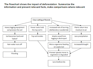
Academic Writing Task 1 Flowchart The flowchart shows the impact of deforestation


The flowchart shows the impact of deforestation. Summarize the information and present relevant facts, make comparisons where relevant .
Write at least 150 words.  
The flowchart shows the impact of deforestation
IELTS Academic Writing Task 1 Flowchart 

The given flowchart elucidates information about the impact of denuding the earth. 

On an overall, cutting down the trees exposes the area to risk of flooding and lack of biodiversity. 

When green cover is cleared, it leaves soil exposed to the sun. the situation is exacerbated by heavy logging equipment used to logging process that compresses the soil as it passes through the area. Once the soil get sunlight, it is baked hard. This impairs the ability of the soil to  soak the water.  Thus, resulting in water run-off whenever there are rains, and causing flooding. 

Besides this, cutting the trees deprives the soil of roots that eventually leads to soil erosion. Not only this, this also raises the risk of forest fires, which  causes waste wood to burn along.  This can eliminate microorganisms endemic to the area. As fresh pioneer species set in, local vegetation degrades. Furthermore ,   as plants return back lesser moisture to air, it decreases rains. Hence, causing drought. All these factors lead to loss of biodiversity.


Thursday, August 22, 2019

Academic Writing Task 1 - graphs The Graph below shows the number of passenger railways journeys made in Great Britain


The Graph below shows the number of passenger railways journeys made in Great Britain between 1950 and 2005.
Summarize the information by selecting and rpoeting the main features, and make comparisonbs where relevant.
Write at least 150 words


 Number of passenger railways journeys made in Great Britain
IELTS WRITING TASK 1  number of passenger railways journeys made in Great Britain 


The present line graph highlights and compares changes in passenger traffic in three rail networks in Britain from 1950 and 2004/05

Quite strikingly, national rail network and London underground witnessed nearly similar pattern while number of passenger railway journeys made on light rail and metro station had a contrasting pattern.

In 1950 the number of passengers using national rail network was 1000 and London underground was approximately 745 million. From 1950 to 1975 while the former experience an initial rise to almost 1100 million and then consistently fell the traffic on the later remained constant . However , after that both the networks experienced a dip touching 745 million and 500 million respectively .

Post this period there was a rise in number of annual passengers on both the networks after surpassing each other several times London underground crossed 1000 million mark . In national rail network touched almost these numbers .

However , the growth in third network was unremarkable from approximately 100 million to 200 million from 1962 to 2004/5


Monday, August 19, 2019

Ielts Academic Writing Task 1 Graphs and pie-charts Water usage in different countries in 2000


The Charts Below Give information about the way in which water was used in different countries in 2000.
Summarize the information by selecting and reporting the main features, and makes comparisons where relevant.

Write at least 150 words
Water  usage in different countries in 2000
IELTS WRITING TASK 1 - GRAPHS AND PIE CHART


The pie-chart and bar graph elucidate the patterns of water consumption in the world in 2000 and comparable trends in China, India, New Zealand and Canada

On an overall, the largest consumer of water worldwide is agriculture followed by industry and household and consumption in China  is identical to the global consumption, while Canada has a completely contrasting usage pattern.

Agriculture consumed 70% water in 2000 at the global level, while industry accounted for 22% and domestic for 8%. China had a similar pattern with 69%, 22%, 9% respectively. India saw an overwhelming usage in primary sector, 92% while household was the second largest sector with 5% and secondary 3%.

In contrast, in New Zealand, water distribution between agriculture and domestic was more even, 44% and 46% respectively, while industry consumed 10%.

However, Canada witnessed a completely disparate trend, where industry took away a lion's share of this resource, 80%. The second largest consumer was domestic sector which used 12%, and agriculture took the smallest share, barely 8%.