Search This Blog

Friday, November 19, 2021

The diagram below shows the layout of part of building, indicating the position o fire exits. Ielts Academic Writing task 1


The diagram below shows the layout of part of building, indicating the position o fire exits.

Summarize and compare where relevant.

Write at least 150 words


The diagram below shows the layout of part of building


The given diagram elucidates the layout of a building and the evacuation plan in the case of fire.

Overall, in case there is a fire in this premises, everyone should leave their bedrooms and lift and then use the corridor to reach the nearest fire exit and assemble at designated meeting points.

There are two fire exits in this area: fire exit A in the west that leads to meeting point 1, and fire exit B in the north near meeting point 2. There are seven bedrooms and a lift around the corridor. In case there is a fire in this premises/area, the people in bedrooms labeled 1,2 and 3 should immediately leave their rooms and use fire exit A to get out of the building and reach meeting point 1. Moving further, the occupants of bedrooms no 4,5,6 and 7, and those in the lift should abandon these areas and evacuate through the fire exit B and go to the meeting point 2.

The chart Below shows the results of a survey about people's coffee and tea buying and drinking habits in five Australian cities Ielts Academic Writisg Task 1

The chart Below shows the results of a survey about people's coffee and tea buying and drinking habits in five Australian cities.

Summarize the information by selecting and reporting the main features, and make comparisons where relevant.

Write at least 150 words


The chart Below shows the results of a survey about people's coffee and tea buying and drinking habits in five Australian cities


The given chart elucidates outcomes of a survey regarding the patterns of people drinking and consuming coffee and tea in five Australian cities over the last 4 weeks.

Overall, most visited a cafe in all cities except Adelaide with the highest numbers confirming in Melbourne and Hobart, while when in case of buying instant coffee, Brisbane reported highest ratios, and highest percentage bought fresh coffee in Sydney.


Most visited a cafe for a tea or coffee, with Hobart and Melbourne leading with nearly 64%. This was followed by Sydney, almost 61%, Brisbane, 55, and Adelaide, just under 50%.

Moving further, instant coffee was bought by consumers in Hobart, nearly 55%, followed by Brisbane, 53%, Adelaide, 50% - it ranked slightly higher than visitors to cafes, Melbourne and Sydney with approximately 47% and 45% respectively.  

Similarly, the ratio of those buying fresh coffee ranked lowest, Sydney had the highest takers with 43%, closely followed with Melbourne, 43%. Hobart reported nearly 38% and Adelaide and Brisbane had almost 35% each. 

Monday, August 9, 2021

Ielts Writing Task 1 Diagrams The diagram illustrates the changes in the west park secondary school and its surroundings since its construction in 1950.


The diagram illustrates the changes in the west park secondary school and its surroundings since its construction in 1950.


The diagram illustrates the changes in the west park secondary school and its surroundings since its construction in 1950. 

Overall, the numerous changes took place from 1950 to 2010. Everything underwent a modification, except the school building.  The houses and fields were sacrificed and the playground was shrunk in size. Some new additions were also made  

In 1950, there was the school building by the main road with a playground behind it, with housing to the west of  it and a field behind houses. From 1950 to 1980, while the school building remained unchanged, a chemistry block adjacent to it and a car park were added replacing the residential units. The fields were converted into a sports ground. 

Moving further, between 1980 and 2010, some more alterations took place. The car park was expanded by including the sports ground while the latter was shifted to east, and accommodated within the playground, which was shrunk in size. However, the school building and chemistry block remained unchanged.  


Ielts Writing Task 1 Diagrams The below given diagram presents home smokery

The below given diagram presents home smokery.

Summarize and make comparisons where relevant.

Write at least 150 words  

home smokery

The given diagram depicts a home smokery that is used to cook fish.

Overall a home smokery needs two underground pits with lids, locks, pipes and a box at the ground level.

To start with, To create a home smokery one needs to dig two pits which are connected with an underground tunnel and are covered with lids. The second pit is connected to a box with the help of a pipe that helps transfer heat and smoke to the box. In the second pit, the fire is lit using logs and is covered with a lid. In the meanwhile, the lid of the first pit is lifted slightly to let the fresh air in, this air travels to the second pit using the tunnel and allows the fire to burn. The smoke and heat travel to the box kept at ground level through the pipe, connecting it and the box. The heat and smoke from the pipe, in turn, cooks the fish in the box.

Wednesday, April 28, 2021

Ielts Academic Writing Task 1 The two maps below show road access to a city hospital in 2007 and 2010


The two maps below show road access to a city hospital in 2007 and 2010.

Summarize the information by selecting and reporting the main features, and make comparisons where relevant.

Write at least 150 words  


The two maps below show road access to a city hospital in 2007 and 2010


The given maps depict the changes in layout of the road access to a city hospital in a three year gap from 2007 to 2010.

Overall, it can be observed that major changes have taken place: a new car park for public vehicles has been constructed on the east side of city hospital and bus stops along hospital roads have been replaced by a full-fledged bus station opposite to the staff car park.

Significant changes have taken place on the ends of hospital road, the T-junction on the north end connecting it to the ring road and the cross junction on the south end connecting it to the city road are replaced by two roundabout circles, and both of them have exits to the new bus station.

Car park for staff and public car has been separated, while staff car park remains at the same place which is east of hospital road, public car park is shifted to east side of city hospital with access from ring road eastern section.


Ielts Academic Writing Task 1 Diagrams The diagram below shows how electricity is generated in a hydroelectric power station


The diagram below shows how electricity is generated in a hydroelectric power station.

Summarize the information by selecting and reporting the main features, and make comparisons where relevant.

Write at least 150 words 


The given diagram describes the process of electricity production in a dam with reversible turbines. 

Overall, such an electricity generation facility requires a dam with two reservoirs, upper and lower, a tunnel to channelize water, a reversible turbine, and a generator. This installation generates electricity during the day. 

During the day, water from the high-level reservoir behind the dam, which is sent to the low-level reservoir with the help of the tunnel by opening the intake. The water, while flowing towards the lower reservoir passes through the power station, driving reversible turbines in the process. The turbines in turn drive the generator which produces electricity. The electricity generated is supplied to the national grid with help of power cables.  

During the night, the intake is closed in the high-level reservoir, and water is pumped back to the this reservoir from the low-level using reversible turbines, which start working backwards, and  with the help of the water tunnel, pump back the water to the high-level reservoir. 

Wednesday, April 21, 2021

Ielts Academic Writing Task 1 The pie charts below show exports from various EU countries to India and China


The pie charts below show exports from various EU countries to India and China in 2005 and 2015.

Summarize the information by selecting and reporting the main features, and make comparisons where relevant. 

The pie charts below show exports from various EU countries to India and China in 2005 and 2015


The given pie-charts elucidate and compare changes in the patterns of exports from EU to India and China between 2005-2015.

Overall, in case of India there was a major shift in the given decade where Germany became the major source to india by replacing the UK, while in case of China, Germany was already exporting more goods to this country, and consolidated this position in the following decade, by accounting for nearly half of this exports. 

In 2005, most of the goods to India from the EU were exported by the UK (29%); this was followed by Belgium (25%) and Germany   (15%). The rest of  other countries had exports under 10%. But between 2005-2015 the composition of exports changed dramatically, Germany accounting for 25% followed by Belgium (20%) a fall of 5% while the UK witnessed more than twofold to 13%.

However, in China in 2005 most imports from the EU were from  Germany (38%) and France (13%). Over the next decade the share of Germany rose to 48%.  

Wednesday, March 17, 2021

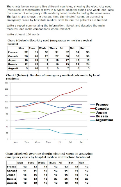
Ielts Academic Writing Task 1 The charts below compare five different countries


The charts below compare five different countries, showing the electricity used (measured in megawatts or mw) in a typical hospital during one week, and  also the number of emergency calls made by local residents during the same week. The last charts shows the average time (in minutes) spent on assessing emergency cases by hospitals medical staff before the patients are treated.

Write a report summarizing the information. Select and describe the main features, and make comparisons where relevant.

Write at least 150 words


The charts below compare five different countries


The given tables and graph elucidate the consumption of electricity(in megawatts), calls made by locals and average time taken to assess medical emergency cases by hospitals in 5 countries in a week. 

Overall, the patterns in terms of energy consumption, and number of emergency medical calls show identical patterns in different countries, except the average time taken to pre-assess emergency cases. 

In terms of energy consumption and calls,  France and Japan depict similar trends with limited fluctuations, between 12-14 and 15-16, and 100-120 and 80-90 respectively, while  in Canada and Russia, both energy tend to rise, from 26-38 and 12-24, and over 100 - over 160 and 60-110 respectively, whereas, Argentina experiences lowest incidence in both which also declines from 9 to 5 towards weekend.   

However, when it comes to the average time spent to assess emergencies before treatment, France, Canada, Japan do not witness much change, ranging between 11-16 minutes; in Argentina it stays constant at 12 minutes, but Russia experiences a rise from 12-28 minutes over the week.  


Sunday, February 7, 2021

Ielts Academic Writing Task 1 Graph The table below shows the figures for imprisonment the five countries between 1930 and 1980


The table below shows the figures for imprisonment the five countries between 1930 and 1980.

Write a report for a university professor, lecturer describing the information shown below

Write at least 150 words


The given bar chart elucidates the trends of imprisonments in five countries, between 1930-1980. 

Overall, while the number of prisoners in the UK rose consistently in five decades, the other four countries witnessed fluctuation in numbers. Similarly, while Canada had the highest number of prisoners in 1930, the US surpassed all other nations in the given period, and had the highest number of convicts in 1980. 

The number of prison sentences in the UK rose consistently from approximately 30,000 to over 80,000 from 1930-80. In contrast, Canada had 120000 prisoners in 1930, it fell upto 1980 touching nearly 90,000, but not without fluctuations. New Zealand and Australia saw similar trends, plummeting from 100 and 70 in 1930 respectively to approximately 45 and 42 in 1950 saw a rise to over 80 while the latter fell further to 50. The number of respectively, rising back to over 60 in 1970. In the next decade, the former convicts in the US touched almost 140. 

Friday, February 5, 2021

Ielts Academic Writing Task 1 Diagrams The diagrams below show the life cycle of a species of large fish called the salmon

The diagrams below show the life cycle of a species of large fish called the salmon.

Summarize the information by selecting and reporting the main features, and make comparisons where relevant.

 Write at least 150 words 

The diagrams below show the life cycle of a species of large fish called the salmon


The given diagram elucidates different phases in the life cycle of salmon along with the time spent in each phase, from hatching from the eggs to laying eggs.


Overall, this fish experiences three stages over roughly nine and a half years, in which it travels from the point of its origin to the seas and back, and passes through distinct stages and grows in size.


The life cycle of salmon starts when adult fish spawn in the slow moving waters of the upper river, under the reeds and in stones. These eggs hatch into small fish, fry, measuring between 3-8cm. It stays in these waters for 5 to 6 months. After this, as it grows bigger and attains the size between 12-15cm, at this stage it is termed as smolts, it moves to the lower river with slow moving waters and spends 4 years. Further, it moves into open seas for 5 years where it becomes an adult measuring 70-76cm. The adult fish swims back to upper river for spawning.


Saturday, January 16, 2021

Ielts Academic Writing Task 1 Pie Charts The charts below show the average percentages in typical meals of three meals of nutrients


The charts below show the average percentages in typical meals of three meals of nutrients, all which may be unhealthy if eaten too much.

Summarize the information by selecting and reporting the main features, and make comparisons where relevant.

Write at least 150 words  


 The charts below show the average percentages in typical meals of three meals of nutrients


The given pie charts illustrate per person average consumption of three nutrients, which can be harmful if consumed in excess, namely, sodium saturated fat and added sugar, in the USA . 

Overall, the average intake of sodium and saturated fats is highest, quite similar in patterns, in dinner while that of added sugar is in snacks. However, interestingly, these nutrients are consumed least in breakfast.   

The people of the USA consume most of Sodium and saturated fat in dinner, 43% and 37% respectively, this is followed by intake during lunch, 29% and 26% respectively, and snacks, 14% and 21% respectively. The consumption of this element in breakfast is similar to snacks in case of the former while it is 16% in case of the latter.

In contrast, the consumption pattern of added sugars is highest with snacks, 42%, which is followed by dinner, 23% and lunch, 19%. Quite strikingly, the intake of this element is the lowest when  people have breakfast, 16%.