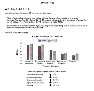
The chart below shows
the value of one country's exports in various categories during 2015 and 2016. The
table shows the percentage change in each category of exports in 2016 compared
to 2015.
Summarize the information
by selecting and reporting the main features and make comparisons where
relevant.
Write at least 150 words
The graph and table elucidate alterations in exports and value of
5 categories of goods in a country in two years, 2015 and 2016
Overall, patterns of changes in exports and value of supplied categories correspond to each other, where textiles witnessed an exponential jump in exports and value, gems and jewellery saw a decline.
In case of exports, biggest jump was seen in textiles, rising from approximately $35 to $40 billion, this was followed by engineering goods from nearly 63 to almost 70 billions, petroleum products from 70 to 72 billions approximately, and agri-products from 38 to 40 billions. However, the exports of gems and jewellery saw a downfall from almost 52 to almost 50 billions.
Similarly, when assessing the changes in the value, an identical pattern can be observed where the highest value addition took place in textiles, 15.24%, followed by engineering, petroleum, agriculture which saw addition of 8%, 3% and 5.18% respectively. In contrast, gem and jewellery registered a fall of .81%

