Search This Blog

Tuesday, October 10, 2023

The Bar graph below shows the percentage of waste recyled by housholds of a city in the year 1992, 1997 and 2002. Summarise and compare where relevant.

The Bar graph below shows the percentage of waste recyled by housholds of a city in the  year 1992, 1997 and 2002. 
Summarise and compare where relevant. 
Write at least 150 words 

The Bar graph below shows the percentage of waste recyled by housholds


The supplied graph elucidates and compares the proportion of distinct categories of domestic refuse reprocessed in a city from 1992 to 2002.

At the outset, in 1992, cans were the highest recycled products with almost 13%, followed by plastic and paper with a negligible difference as compared to the former, and glass was the lowest. Nonetheless, from 1992 to 1997, glass increased to nearly 29%, whereas paper and plastic also registered an increment, reaching to around 18% and 11% respectively, but cans dipped to 11% approximately which was the least.

Similarly, between 1997 and 2002, recycling of the glass witnessed an exponential rise to almost 49%, followed by paper and the cans that climbed to  almost 29% and 21% respectively; however, the percentage of plastic recycled remained unchanged.

Overall, it is conspicuous that glass had accounted for an upward movement and paper also witnessed the similar pattern. Nevertheless, cans went through an oscillating trend, whereas the proportion of plastic reused was stable after an initial rise.


Tuesday, August 1, 2023

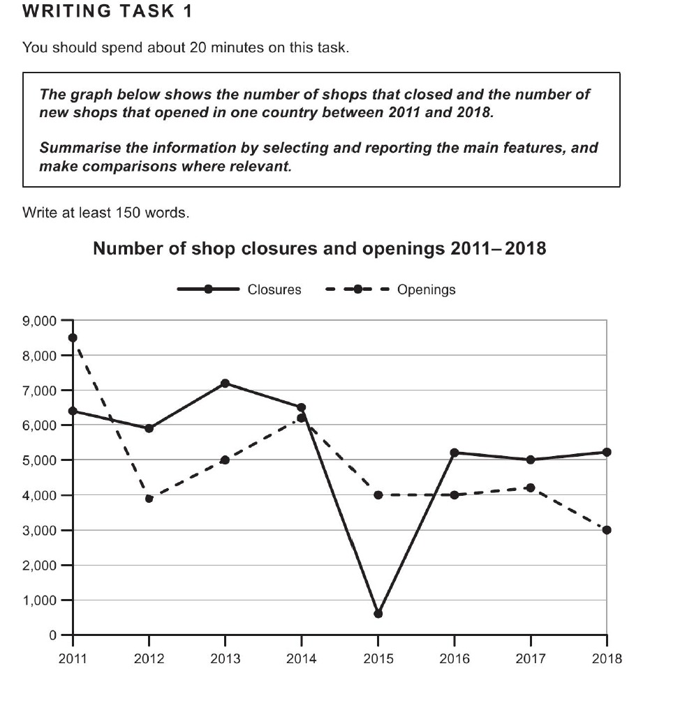
The graph below shows the number of shops that closed and the number of new shops that opened in one country between 2011 and 2018

The graph below shows the number of shops that closed and the number of new shops that opened in one country between 2011 and 2018. 

Summarize the information by selecting and reporting the main features, and make comparisons where relevant. 


The given line graph elucidates and compares the patterns of opening and closure of shops in a country between 2011 and 2018.      

In general, in 2011, approximately 8500 new outlets were established, but over the next year up to 2012 numbers slid down sharply to under 4000. From 2012-2014 there was an increment of more than 2000 shops being opened, the number reaching to over 6000. Moving further, there was a decline over the next four years; fewer stores were opened with the figures plummeting to 3000 by 2018, even though there was a stability for two years between 2015 and 2017 when both years saw yearly 4000 shops starting each year.

In continuation, although the number of stores shutting down experienced similar patterns, they overtook the figures of new openings. In 2011, almost 6200 shops  closed, and between 2011 and 2014 there was an ascent to 6400 following fluctuations. From 2014-2015 there was a notable dip to almost 700, but by 2018 it climbed back to over 5000.


Wednesday, February 8, 2023

The charts below give information on the ages of people when they got married in one particular country in 1996 and 2008.

The charts below give information on the ages of people when they got married in one particular country in 1996 and 2008.
Write a summary for a university professor by mentioning and comparing the relevant details.
Write at least 150 words   

The charts below give information on the ages of people when they got married in one particular country in 1996 and 2008.


The given graphs elucidate and compare patterns of age-wise marriages of males and females between 1996 and 2008

In 1996, in the case of females, the number of individuals marrying was lowest in the 16-19 group, nearly 1%, but the ratio rose up to 25-29, touching almost 12%. Beyond that age group, the percentage dipped gradually, reaching 2% in the 40-44 group. Further, the males also registered a similar pattern with numbers peaking at 25-29 and 30-34 groups, approximately 9%. In this case too, the numbers fell to under 6% in 40-44 group. 

In contrast, although the trend in the former gender remained almost identical with 25-29 registering similar number of marriages, there was a decline in some groups: 20-24, falling from 6 to almost 3% and 35-39, plunging from 4 to almost 2%, but 30-34 witnessed a rise from about 7 to 8%, the latter gender saw a shift in highest to 35-39 group that climbed to nearly 12 from 7%. Other groups registered falls and rises.


Wednesday, November 2, 2022

The below diagrams are layouts of an American office and a Japanese office. Prepare a summary for your lecturer and make comparisions where relevant.

The below diagrams are layouts of an American office and a Japanese office. Prepare a summary for your lecturer and make comparisions  where relevant. 


Ielts Academic Writing Task a The below diagrams are layouts of an American office and a Japanese office


 The given layouts elucidate and compare the office floor arrangement of an American and Japanese company.

The  Japanese office floor settings exhibit a democratic setup: the office hall has a window on the top; in the front of it, the space is allocated to the department manager. Opposite of him, the seating arrangement for the other personnel is done in two rows on the  right and the left.Immediately facing him are section managers, and behind them six clerks sit behind each of their managers. 

However,  American settings illustrate authoritative setup. The floor has two windows on either side, on the left and right . While the right side of this design has three offices, with the one at bottom right belonging to the general manager and the other two sections  managers opposite of the section managers from the across the floor are the room for the copier and the storage, below these are two conference room; the middle space is occupied by ten clerks with five sitting in each rows.


Tuesday, September 13, 2022

Ielts Academic Writing Task 1 Ielts Graph below shows the number of shops that closed and the number of new shops that opened in one country between 2011-2018


The Graph below shows the number of shops that closed and the number of new shops that opened in one country between 2011-2018.

Summarize the Infomation by selecting and reporting the main features, and make comparisions where relevant. 

Write at least150 words.  


The given line graph elucidates and compares the patterns of opening and closure of shops in a country between 2011 and 2018.

In general, in 2011, approximately 8500 new outlets were established, but over the next year up to 2012 numbers slid down sharply to under 400. From 2012-2014 there was an increment of more than 2000 shops being opened, the number reaching to over 6000. Moving further, there was a decline over the next four years; fewer stores were opened with the figures plummeting to 3000 by 2018, even though there was a stability for two years between 2015 and 2017 when both years saw yearly 4000 shops starting each year.

In continuation, although the number of stores shutting down experienced similar patterns, they overtook the figures of new openings. In 2011, almost 6200 shops  closed, and between 2011 and 2014 there was an ascent to 6400 following fluctuations. From 2014-2015 there was a notable dip to almost 700, but by 2018 it climbed back to over 5000.


Wednesday, May 18, 2022

Ielts Academic Writing Task 1 Ielts Graph The chart below gives information about Southland’s main exports in 2000, 2022 and future projections for 2025


The chart below gives information about Southland’s main exports in 2000, 2022 and future projections for 2025.

Summarize the information by selecting and reporting the main features, and make comparisons where relevant  

The chart below gives information about Southland’s main exports in 2000, 2022 and future projections for 2025


The given bar graph elucidates and compares changes in exports of three items from Scotland from 2000-2022 and presents forecasts for 2025. The quantum of exports is calibrated in billion pounds.  

To start with, in 2000, international tourism helped gross just over 8 billion pounds, while dairy products fetched 7 billion pounds. The exports of meat products stood at 6 billion pounds.

From 2000 to 2020, there was an increment in the earnings of international tourism from 8 to almost 9 billion pounds, and even though dairy products also registered a rise, it was quite steep as it climbed to nearly 10 billion pounds. In contrast, meat products   witnessed a fall from 6 to about 5.5 billion pounds. 

Moving further, the predictions for 2025 show that international tourism would continue to ascend and reach approximately 10 billion pounds, whereas dairy products are expected to plummet to near about 9.5 billion pounds. Meat products will continue to slide down further to 5 billion pounds.  


Tuesday, May 3, 2022

Ielts Academic Writing Task 1 - The chart below shows what Anthropology graduates from one university did after finishing their undergraduate degree course


The chart below shows what Anthropology graduates from one university did after finishing their undergraduate degree course. The table shows the salaries of anthropologists in work after five years.

Summarize the information by selecting and reporting the main features, and make comparisons where relevant.

Write at least 150 words.

The chart below shows what Anthropology graduates from one university did after finishing their undergraduate degree course


The given pie chart and table elucidate and compare information about destination of Anthropology undergraduates from a university and their earnings after five years of working in different sectors.

Overall, a majority of students took up full-time employment, while there was a great variation in the ratio of earnings across three sectors.

A little over half, 52%, of graduates in Anthropology went to join full-time jobs, followed by 15% taking up part-time work. Further, 8% pupils went on to join post graduation, while 5% chose to take up part-time employment and study. Quite strikingly, 12% graduates chose to remain without employment, and there was no information about 8% learners.

As far as the salaries is concerned, being earned after garnering an experience of 5 years, were concerned, quite interestingly, 80% of graduates working freelance or in the government sector were earning 75,000 dollars and more. However, only 55% of those working in private sector had  similar earnings, while 45% had earnings below 75000 dollars.