Search This Blog

Friday, January 9, 2026

The bar graph gives information about the number of animals, dogs, cats, and birds and reptiles from an animal rescue center in Madison, Winsconsin over a 10 year period

 The bar graph gives information about the number of animals, dogs, cats, and birds and reptiles from an animal rescue center in Madison, Winsconsin, from 1990 to 2000. Summarize the information and reporting the main features, and make comparisons where relevant. 


The supplied graph depicts information regarding adoption from an animal rescue center in Madison, Wisconsin, from 1990 to 2000. The data is calibrated per hundred animals.

Overall, whereas adopted dogs underwent a gradual decline from 1990 till 1996 and later remained steady in the last two years, the number of cats experienced rapid incline till 1996 and gradual increment till 2000. Moving further, birds and other reptiles showed a fluctuating pattern.

To start with,  the number of adopted dogs decreased from 580 in 1990 to 420 in 1996, and remained steady at 400  up to 2000. On the contrary, cats face a rapid ascent from 320 in 1990 to reaching 600 in 1996 and further, a gradual rise from 1998 to reaching  680 in 2000.

Looking at the rest of the data, birds and reptiles registered an oscillating  pattern as it first declined from 120 in 1990 to 80 in 1992, then climbed to 140 in 1996, and then declined  in 1998 and finally touched a 100 in 2000.


The graph below gives information about the use of media such as the internet, radio, TV and Newspaper, in the years 2001, 2003 and 2005

The graph below gives information about the use of media such as the internet, radio, TV and Newspaper, in the years 2001, 2003 and 2005. Summarize the information by selecting and reporting the main features,and make comparions whererelevant.  


The given bar graph elucidates and compares the patterns of consumption  of Internet,Radio,TV,and Newspaper from 2001 to 2005.

To commence with, 40%  of the UK population was using the Internet in 2001 which rose to 60 by  2005 witnessing an increment of 10 percent rise every alternate year. In comparison to the Internet, consumption of Radio by the UK populace was completely opposite, it fell from 63% in 2001 to 40% by 2005. 

Moving further, the use of television remained constant from 2001 to 2003 at 20%, and declined marginally to 19% over the next 2 years. The use of Newspapers was 5% in 2001, and slid to 3% upto 2003 and then stabilised  

Overall, we can see Internet and Radio inversely proportional to each other,Internet witnessing a rise and Radio declining on the other hand TV and Newspaper consumption were  the least and declined further. 

The graph below gives information about international tourist arrivals in different parts of the world.


The graph below gives information about international tourist arrivals in different parts of the world. Summarize the information by selecting and reporting the main features,and make comparions whererelevant.  

The line graph illustrates the number of international tourist arrivals in five different world regions: North America, Central and Eastern Europe, South-East Asia, Sub-Saharan Africa, and South America from 1990 to 2005.

Overall, North America received the highest number of visitors throughout the period, whereas Central and Eastern Europe experienced the most rapid growth, and nearly matched North America by 2005. In contrast, Sub-Saharan Africa and South America consistently recorded the lowest figures.

In 1990, North America attracted around 70 million tourists, and this number rose steadily to a peak of roughly 90 million in 2000, followed by a slight decline by 2005. Central and Eastern Europe, starting at approximately 30 million in 1990, showed a significant upward trend and reached nearly 90 million at the end of the period.

Tourist arrivals in South-East Asia grew moderately from about 21 million in 1990 to around 48 million in 2005. Meanwhile, Sub-Saharan Africa and South America had relatively low levels in 1990, under 20 million each, and climbed gradually to about 22 million and 20 million respectively by 2005.


Wednesday, May 15, 2024

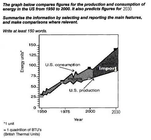
The graph below compares figures for the production and consumption of energy in the US from 1950 to 2000. It also predicts the figures for 2030.


The graph below compares figures for the production and consumption of energy in the US from 1950 to 2000. It also predicts the figures for 2030.
Summarize the information by selecting and reporting the main features, and make comparisons where relevant.

Write at least 150 words. 

The graph below compares figures for the production and consumption of energy in the US from 1950 to 2030


The given line graph highlights the figures for the production and consumption of energy in the US between 1950 to 2000 and predictions up to 2030. 

Overall, up to 1975, both consumption and generation of energy remained parallel, but after that the gap widened, and will further increase up to 2030. 

In 1950, the consumption and production were almost 25 quadrillion BTUs, over the next 25 years up to 1975, both rose side by side to almost 60 and slightly less than 60  respectively. However from 1975 to 2000 while the former rose phenomenally to  almost 100 BTUs, the  latter failed to keep up the pace and reached just over 60 approximately, the deficit was plugged with power imports, which rose consistently. 

The forecasts for 2030 show, it can be seen that there will be a spike in the consumption, which is expected to touch almost 156 BTUs, but the  production will nonetheless rise gradually remaining well under 100 BTUs, reaching 80 BTUs. This implies that imports will rise further.


Friday, February 23, 2024

The Chart below shows the percentage of river water in the UK rivers classified as having good chemical quality between 1990 and 1992


The Chart below shows the percentage of river water in the UK rivers classified as having good chemical quality between 1990 and 1992

The Chart below shows the percentage of river water in the UK rivers classified as having good chemical quality between 1990 and 1992


The given line graph elucidates and compares the river water in Wales, Scotland, Northern Ireland and England between 1990 and 2002. 

Overall, patterns of changes in chemical qualities of water were dissimilar in all states, except in the case of Wales and Scotland,  which stayed constant up to 1998. Furthermore, the quantity of good chemicals increased in all provinces, but in Wales it declined. And in Scotland and Ireland, the percentage of good chemicals was the highest  in 2000. 

In  1990 the ratio of good chemicals in water in Wales was approximately 96% and 95% in Scotland. These proportions remained stable from 1990 to 1998, but after that while there was a decline to nearly 94% in the former, the latter saw an increment nearly 97%. Moving further, even though Northern Ireland witnessed a fall from almost 93% to about 83% with a fluctuation, saw a steam rise in 1996 and 2002, reaching at power with Scotland. England, although the lowest, saw an incline from 82% to 90%.


Friday, December 29, 2023

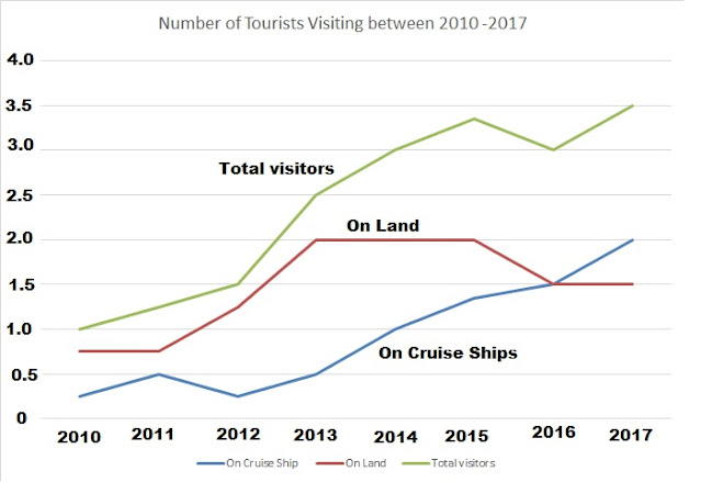
The graph below shows the number of tourists visiting a particular Caribbean island between 2010 and 2017

 The graph below shows the number of tourists visiting a particular Caribbean island between 2010 and 2017. Summarize the information by selecting and reporting the main features, and make comparisons where relevant.

Write at least 150 words. 
The graph below shows the number of tourists visiting a particular Caribbean island between 2010 and 2017


The graph elucidates the number of tourists visiting a Caribbean Island between the period of 2010 and 2017.

Overall, the visitors staying on cruise ships and the total number of visitors experienced similar trends. The former increased upto 2011, however, declined in 2012; they further increased up till 2017. Similarly, the total numbers of visitors rose upto 2015; the trend remained constant till 2016 and spiked in 2017.

In 2010, the visitors on ships were 0.5 million, but fell to approximately 0.25 in 2012. The numbers then experienced an upward trend till 2017 to 2 million. However, the those staying on the island remained constant till 2011 at almost 0.75; the numbers of increased upto  2013 to 2.0, but remained unchanged till 2015, and decreased up to 2016 to nearly 1.5 million. However, it climbed slightly to 1.5 up to 2017.

The total visitors went up over 3.0 million up to  2015; thereafter, after a dip till 2016, it witnessed a surge to 3.5.  

Tuesday, October 10, 2023

The Bar graph below shows the percentage of waste recyled by housholds of a city in the year 1992, 1997 and 2002. Summarise and compare where relevant.

The Bar graph below shows the percentage of waste recyled by housholds of a city in the  year 1992, 1997 and 2002. 
Summarise and compare where relevant. 
Write at least 150 words 

The Bar graph below shows the percentage of waste recyled by housholds


The supplied graph elucidates and compares the proportion of distinct categories of domestic refuse reprocessed in a city from 1992 to 2002.

At the outset, in 1992, cans were the highest recycled products with almost 13%, followed by plastic and paper with a negligible difference as compared to the former, and glass was the lowest. Nonetheless, from 1992 to 1997, glass increased to nearly 29%, whereas paper and plastic also registered an increment, reaching to around 18% and 11% respectively, but cans dipped to 11% approximately which was the least.

Similarly, between 1997 and 2002, recycling of the glass witnessed an exponential rise to almost 49%, followed by paper and the cans that climbed to  almost 29% and 21% respectively; however, the percentage of plastic recycled remained unchanged.

Overall, it is conspicuous that glass had accounted for an upward movement and paper also witnessed the similar pattern. Nevertheless, cans went through an oscillating trend, whereas the proportion of plastic reused was stable after an initial rise.