Search This Blog

Wednesday, May 18, 2022

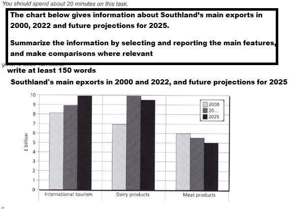
Ielts Academic Writing Task 1 Ielts Graph The chart below gives information about Southland’s main exports in 2000, 2022 and future projections for 2025


The chart below gives information about Southland’s main exports in 2000, 2022 and future projections for 2025.

Summarize the information by selecting and reporting the main features, and make comparisons where relevant  

The chart below gives information about Southland’s main exports in 2000, 2022 and future projections for 2025


The given bar graph elucidates and compares changes in exports of three items from Scotland from 2000-2022 and presents forecasts for 2025. The quantum of exports is calibrated in billion pounds.  

To start with, in 2000, international tourism helped gross just over 8 billion pounds, while dairy products fetched 7 billion pounds. The exports of meat products stood at 6 billion pounds.

From 2000 to 2020, there was an increment in the earnings of international tourism from 8 to almost 9 billion pounds, and even though dairy products also registered a rise, it was quite steep as it climbed to nearly 10 billion pounds. In contrast, meat products   witnessed a fall from 6 to about 5.5 billion pounds. 

Moving further, the predictions for 2025 show that international tourism would continue to ascend and reach approximately 10 billion pounds, whereas dairy products are expected to plummet to near about 9.5 billion pounds. Meat products will continue to slide down further to 5 billion pounds.  


Tuesday, May 3, 2022

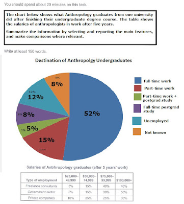
Ielts Academic Writing Task 1 - The chart below shows what Anthropology graduates from one university did after finishing their undergraduate degree course


The chart below shows what Anthropology graduates from one university did after finishing their undergraduate degree course. The table shows the salaries of anthropologists in work after five years.

Summarize the information by selecting and reporting the main features, and make comparisons where relevant.

Write at least 150 words.

The chart below shows what Anthropology graduates from one university did after finishing their undergraduate degree course


The given pie chart and table elucidate and compare information about destination of Anthropology undergraduates from a university and their earnings after five years of working in different sectors.

Overall, a majority of students took up full-time employment, while there was a great variation in the ratio of earnings across three sectors.

A little over half, 52%, of graduates in Anthropology went to join full-time jobs, followed by 15% taking up part-time work. Further, 8% pupils went on to join post graduation, while 5% chose to take up part-time employment and study. Quite strikingly, 12% graduates chose to remain without employment, and there was no information about 8% learners.

As far as the salaries is concerned, being earned after garnering an experience of 5 years, were concerned, quite interestingly, 80% of graduates working freelance or in the government sector were earning 75,000 dollars and more. However, only 55% of those working in private sector had  similar earnings, while 45% had earnings below 75000 dollars.