The Charts below give information on the
ages of the populations of Yemen and Italy in 2000 and 2050.
Summarize the information by selecting and
reporting the main features, and make comparisons where relevant.
Write at least 150 words
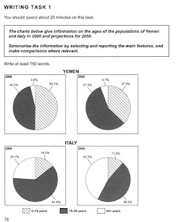
The given charts elucidate changes in demographic
composition, in terms of age, in Italy and Yemen between 2000 and 2050.
On an overall, both countries will experience similar trends
– population of old people would rise though more steeply in Italy, while ratio
of the youngest would decrease. However, where in Yemen proportion of people
aged between 15-59 years would rise, it would decline in Italy.
In Yemen, in 2000, most of the population was aged between
0-14 years, 50.1%, it was followed by age group 15-59, 46.3%, and 60+ years,
3.6%. By 2050, where the ratio of people in age group 15-59 would swell to
57.%, and that of very old would rise to 5.7%, the number of the youngest would
shrink to 37%.
But, Italy which had 61.6% people in 15-59 age group,
followed by 60+, 24.1% and 0-14, 14.3%,
in 2000, may experience a contrasting trend. The ratio of people over 60
would be 42.3%, whereas, the population of 0-14 and 15-59 would fall to 11.5
and 46.2% respectively.

