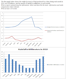
The first graph below shows the weight (in
tones) of fruit produced by a farm during each month in 2010, use of
fertilizers, and the amount of rainfall, in millimeters, in each month.
Write a
report summarizing the information. Select and describe the main information and make comparisons where
relevant.
Write
at least 150 words.
The given graphs compare fruit produced,
fertilizers used and amount of rainfall, in a farm in 2010
Overall, trends of yield of fruits are
inversely proportional to use of fertilizers and amount of rainfall – yield of
fruit was high when use of fertilizers and rainfall was low.
In January, the harvest of fruit was 2.5 tone
and stayed stable till April. After this, the yield rose dramatically and
touched a peak of almost 4.5 tonnes in
September. From there on the yield declined to levels of January though the
decline was more remarkable in the month of October.
While, the use of fertilizers rose from .5
tonnes to almost 1 tonne and declined to nearly zero in June , but from July
to November it rose, touching the peak
in November, 0.7 tonnes and declining again. The rainfall seems to coincide
with the fertilizer, falling from a high of 16 mm in January to 4mm in July and
then rising to 14 mm in December.

