Search This Blog

Wednesday, May 30, 2018

Ielts Academic Writing Task 1 Graphs The charts below give information about USA marriages and divorces rates between 1970 and 2000I


The charts below give information about USA marriages and divorces rates between 1970 and 2000, and the marital statis of adult americans in two of the years.
Summarize the informartion by selecting and reporting the main features, and make comparisons where relevant.
The charts below give information about USA marriages and divorces rates between 1970 and 2000
Ielts Writing Task 1 Graphs - Marriages and Divorces 
Write at least 150 words

The given charts elucidate information about number of marriages and divorces in the USA and changes in marital status between 1970-2000.

Overall, numbers of marriages fell in the given period though between 1970-1980, while te number of divorce cases initially increased then declined. The marital status also witnessed changes.

From 1970 to 1980 the number of marriages stayed stable at 2.5 millions, while legal separations registered a rise from 1 million to  nearly 1.4 million. From 1980 to 2000 marriages lesser and lesser American married – numbers fell from 2.5 to 2 million, similarly lesser numbers sought divorces – numbers fell to 1 million.

As far as the changes in marital status of adult Americans is concerned, there was a rise in number of people choosing to stay unmarried, from  12% to 20% , and getting a divorce, from nearly 2% to 10%. There was, however,  a 10% decline in the ratio of people getting married, fell from 70% to 60%, and a marginal decrease in widowed people, approximately 8% to 6%.  


Sunday, May 27, 2018

Ielts Academic Writing task 1 Bar Graphs The chart below shows the total number of minutes (in billions) of telephone calls in the UK


The chart below shows the total number of minutes (in billions) of telephone calls in the UK, divided into three categories, from 1995 – 2002.
Summarize the information by selecting and reporting the main features, and make comparisons where relevant.
Write at least 150 words


The given bar chart elucidate and compares the data about minutes ( in billions) logged on three types of calls in the UK between 1995 and 2002.

Overall, it can be observed that even though the local calls made  from fixed line rose and fell, they still remained the highest, while long distance and mobile call minutes registered a contrasting rise through the similar period.

Fixed line local calls registered a rise from 70 billion minutes to 90 million minutes between 1995 and 1999, but fell back to 70 billion minutes from 1999 to 2004.

In contrast, the calls made to other parts of the country and overseas and mobile  registered a rise in the similar period though while the the number minutes on domestic and foreign calls remained ascended steadily, rise in number of mobile phone call minutes was negligible from 1995 to 1998, and after 1998 the number of minutes started rising significantly, rising dramatically nearly four-folds in a matter of next three years reaching 40 billion minutes.  

Thursday, May 24, 2018

Sample Ielts Academic Writing Task 1 - Pie charts The pie-charts below show the percentage of water used for different purposes in sis areas of the world - II

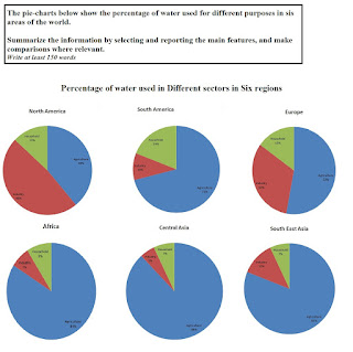
The pie-charts below show the percentage of water used for different purposes in sis areas of the world.

Summarize the information by selecting and reporting the main features, and make comparisons where relevant.
Write at least 150 words

The pie-charts below show the percentage of water used for different purposes in sis areas of the world
Ielts Academic Writing Task 1  Water Usage 

The given pie-charts elucidate information about the ratio of water consumption in different sectors in six regions across the world.

Overall, agriculture  happens to be the largest consumer of water in most of the regions: Central Asia, Africa, South East Asia and South America, except in Europe and North America, where manufacturing  claims a lion share of this resource; however, in South America household uses highest ratio of water among all regions.

Most of the specified areas indicate at an identical water usage pattern: agriculture uses an overwhelming quantity of water in Central Asia, 88%, Africa, 84% and South America, 71%. In these regions, domestic sector is the second biggest user followed by industry, while in Southeast  Asia, industry enjoys second highest demand followed by household sector.     

In contrast, Europe and North America witness a completely different pattern, in terms of demand of water in various sectors: in these regions secondary sector is largest consumer: 53% and 43% respectively, followed by primary sector, 32% and 39% respectively and household.

Sunday, May 13, 2018

Sample Ielts Academic Writing Task 1 - Pie charts The pie-charts below show the percentage of water used for different purposes in sis areas of the worldI


The pie-charts below show the percentage of water used for different purposes in sis areas of the world.

Summarize the information by selecting and reporting the main features, and make comparisons where relevant.
Write at least 150 words

The pie-charts below show the percentage of water used for different purposes in sis areas of the world
Ielts Academic Writing Task 1  Water Usage 

The given pie-charts compare the use of water in three sectors: primary, secondary and domestic, in six regions of the world

Overall, in most of the regions: Central Asia, South East Asia, Africa and South America, agriculture happens to be the major user of water, but in case of Europe and North America, demand for water is more in industry.

Most of the quoted regions had identical water utilization patterns, Central Asia, South East Asia, Africa and South America, water was used in huge quantity in primary sector, 88%, 84%, 81, 71% respectively. In these regions, except South East Asia – where manufacturing followed the agriculture 12% and eventually domestic 7%,  domestic sector was a distant second7%, 9% and 19% respectively, with the secondary sector using the least, 5% 7% and 10% respectively.

However, in Europe and North America demand in secondary sector  was highest, 53% and 48%. In these regions, agriculture was the second biggest consumer, 32%  and 39%, while domestic sector used least, 15% and 13% respectively.

Wednesday, May 9, 2018

Sample Ielts Academic Writing Task 1 - Graphs The Graph below shows the percentage of urban/sub-urban and rural households in the UK having internet access between 1999-2004

The Graph below shows the percentage of urban/sub-urban and rural households in the UK having internet access between 1999-2004
Summarize the information by selecting and reporting the main features, and make comparisons where relevant.
Write at least 150 words
The Graph below shows the percentage of urban/sub-urban and rural households in the UK having internet access between 1999-2004
Ielts Academic Writing Task 1 - Graph INternet Usage in the UK 

The given graph elucidates information about access to internet enjoyed by domestic users in urban-suburban and rural areas in the UK between 1999 and 2001

Overall,  although internet was accessed more by households in cities and suburbs than in rural areas, the gap narrowed  down by 2004. The difference, however, tended to expand between 2000 and 2002.

In 1999 the usage of internet in urban and suburban areas was almost 15%  which doubled up by 2000, 30%. From 2000 to 2002, the usage registered a steady rise of 20%, 10% each year. However, the growth in usage slowed down over the next two years, registering just 5% between 2002 and 2004.


In contrast, in rural areas the  use of internet in regional areas was slow to pick-up rising just  to 10% in 2001 from 1% in 1999, but in the next year the usage rose by 5%, touching nearly 15% in 2002. In the next two years – from 2002 to 2004, the use increased by 20%, 10% each year. 

Thursday, May 3, 2018

Sample Ielts Academic Writing Task 1 - Stacked Bar Chart One Hundred adults, boys and girls in a city were asked to name the sports they participated in. The outcomes were recorded in a stacked bar chart


One Hundred adults, boys and girls in a city were asked to name the sports they participated in. The outcomes were recorded in a stacked bar chart.
Write a report for university professor elaborating the preferences. Make comparison where relevant.
Write in no more than 150 words. 
One Hundred adults, boys and girls in a city were asked to name the sports they participated in. The outcomes were recorded in a stacked bar chart
Ielts Academic Writing Task 1 - Graphs 


The given stacked chart elucidates the responses of 100 respondents, adults, girls and boys, who were surveyed to assess their favorite sports in a city.

On an overall, adults had least participation in all sports except in swimming and tennis, while boys favored football more, and girls liked hockey. Also, boys featured in most of the sports prominently.

It can be observed that swimming was the most popular activity in this city: the boys and girls had equal participation, while the adults were slight lesser in number though this was the second most favorite activity among adults. Similarly, tennis – the second most popular activity besides hockey, had equal representation of  all categories of respondents, this was also the most favorite sport practiced by adults.

In contrast, football and basketball were more popular among boys than girls, especially in football, the participation of girls was negligible.

However, in case of hockey, most of the participants were girls, an overwhelming number.