Search This Blog

Saturday, April 22, 2017

Sample Ielts Academic Writing Task 1 -The graph below shows how money was spent on different forms of entertainment over a five year period.

The graph below shows how money was spent on different forms of entertainment over a five year period.
Summarize the information by selecting and reporting the main features, and make comparisons where relevant.
Write at least 150 words

The graph below shows how money was spent on different forms of entertainment over a five year period.
Ielts Academic Writing task 1 - Graphs 

The given graph illustrates changes in spending on various modes of entertainment in three regions in 1995 and 2000.

Expenditure on entertaining was highest in the USA in both the years, rising from $184 billion to $257 billion though Europe and Asia too registered a rise of 34 billion, from 97 billion to 131 billion, and 43 billion, from 67 billion to 110 billion, respectively.

Quite striking fact was the similarity in percentage of money spent on various modes: television and publishing, were almost similar with parallel rise, were major areas where an overwhelming amount of money, above 70% even though 90% in case of the United States, was spent in all three regions.

Similarly, music also witnessed a two-fold rise, in spite of being moderate, in the US and Asian markets, but Europe on the other hand saw a rather stagnant market.


Video registered a 100% rise in all the three markets despite of quantum being quite limited, but the market of cinema remained stagnant.   

Friday, April 14, 2017

Sample Ielts Academic Writing Task 1 - The given chart shows the amount of money spent on fast food per week in Britain

The given chart shows the amount of money spent on fast food per week in Britain. The graph shows the trends in consumption of fast foods.
Write a report for a university lecturer describing the information given below.
You should write at least 150 words.

The given chart shows the amount of money spent on fast food per week in Britain
Ielts Sample Writing Task 1 - Graphs Hamburgers and Fast Food 

The given chart and graph depict preferences in fast food options among people from three different income groups in, and the changes in consumption of these fast food items between 1970 and 1990.

Elite class consumers spent significantly more than other income groups. The first choice of rich class was hamburgers, with an overwhelming consumption of more than 40 pence per capita per week, while pizza, and fish and chips came in a distant second third.

The middle income group also preferred hamburgers, 33 pence per individual per week followed by fish and chips, and hamburgers. The low income group chose fish and chips over rest of two other fast foods.


As per the graph, the consumption of fish and chips witnessed a steady decline from 1970 to 1990, from 300 grams consumption to almost 200 grams. However, the hamburgers and pizza gained favors as they registered a rise in the corresponding period though the rise of hamburger consumption was steep between 1980 and 1990, ultimately touching 500 grams.

Wednesday, April 12, 2017

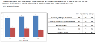
Sample Ielts Academic Task 1 - The Chart and the table below show customer satisfaction levels in the US with airlines and aspects of air travel in 1999, 2000 and 2007.

The Chart and the table below show customer satisfaction levels in the US with airlines and aspects of air travel in 1999, 2000 and 2007.
Summarize the information by selecting and reporting the main features, and make comparisons where relevant.
Sample ielts Acadeimic Writing Task 1

The given bar chart and table illustrate changes in the satisfaction level of airlines passengers in terms of various components in years 1999, 2000 and 2007.

The percentage of contended passengers in the quoted period registered an uninterrupted rise from 65% in 1999 to 72% in 2007 though the rise was drastic between 1999 and 2000, from 65% to 69%.

As far as various aspects of air travel was concerned, there was a rise in percentage of travelers who were happy with courtesy of flight attendants, touching 92% from 88% in corresponding period, and ticket pricing, significantly rising from 45% to 65%.

Almost similarly, a great percentage of people remained satisfied with the schedules of flights, rose from 75 to 79.   

A new component of air travel was also surveyed about in 2007, seat comfort, and 42% felt happy with this aspect.


However, in terms of services of check-in gate staff, lesser satisfaction levels were registered in 2007 in comparison to 2000, from 89 to 88%.