Search This Blog

Wednesday, May 15, 2024

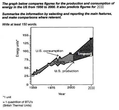
The graph below compares figures for the production and consumption of energy in the US from 1950 to 2000. It also predicts the figures for 2030.


The graph below compares figures for the production and consumption of energy in the US from 1950 to 2000. It also predicts the figures for 2030.
Summarize the information by selecting and reporting the main features, and make comparisons where relevant.

Write at least 150 words. 

The graph below compares figures for the production and consumption of energy in the US from 1950 to 2030


The given line graph highlights the figures for the production and consumption of energy in the US between 1950 to 2000 and predictions up to 2030. 

Overall, up to 1975, both consumption and generation of energy remained parallel, but after that the gap widened, and will further increase up to 2030. 

In 1950, the consumption and production were almost 25 quadrillion BTUs, over the next 25 years up to 1975, both rose side by side to almost 60 and slightly less than 60  respectively. However from 1975 to 2000 while the former rose phenomenally to  almost 100 BTUs, the  latter failed to keep up the pace and reached just over 60 approximately, the deficit was plugged with power imports, which rose consistently. 

The forecasts for 2030 show, it can be seen that there will be a spike in the consumption, which is expected to touch almost 156 BTUs, but the  production will nonetheless rise gradually remaining well under 100 BTUs, reaching 80 BTUs. This implies that imports will rise further.

Friday, February 23, 2024

The Chart below shows the percentage of river water in the UK rivers classified as having good chemical quality between 1990 and 1992


The Chart below shows the percentage of river water in the UK rivers classified as having good chemical quality between 1990 and 1992

The Chart below shows the percentage of river water in the UK rivers classified as having good chemical quality between 1990 and 1992


The given line graph elucidates and compares the river water in Wales, Scotland, Northern Ireland and England between 1990 and 2002. 

Overall, patterns of changes in chemical qualities of water were dissimilar in all states, except in the case of Wales and Scotland,  which stayed constant up to 1998. Furthermore, the quantity of good chemicals increased in all provinces, but in Wales it declined. And in Scotland and Ireland, the percentage of good chemicals was the highest  in 2000. 

In  1990 the ratio of good chemicals in water in Wales was approximately 96% and 95% in Scotland. These proportions remained stable from 1990 to 1998, but after that while there was a decline to nearly 94% in the former, the latter saw an increment nearly 97%. Moving further, even though Northern Ireland witnessed a fall from almost 93% to about 83% with a fluctuation, saw a steam rise in 1996 and 2002, reaching at power with Scotland. England, although the lowest, saw an incline from 82% to 90%.