The charts below give information on the ages of people when they got
married in one particular country in 1996 and 2008.
Write a summary for
a university professor by mentioning and comparing the relevant
details.
Write at least 150
words
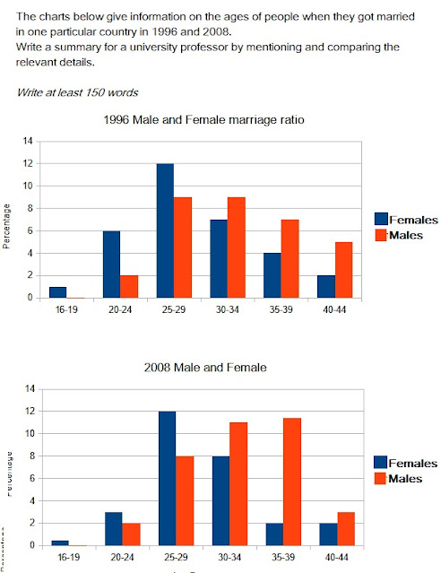
The given graphs elucidate and compare patterns of age-wise marriages of males and females between 1996 and 2008
In 1996, in the case of females, the number of individuals marrying was lowest in the 16-19 group, nearly 1%, but the ratio rose up to 25-29, touching almost 12%. Beyond that age group, the percentage dipped gradually, reaching 2% in the 40-44 group. Further, the males also registered a similar pattern with numbers peaking at 25-29 and 30-34 groups, approximately 9%. In this case too, the numbers fell to under 6% in 40-44 group.
In contrast, although the trend in the former gender remained almost identical with 25-29 registering similar number of marriages, there was a decline in some groups: 20-24, falling from 6 to almost 3% and 35-39, plunging from 4 to almost 2%, but 30-34 witnessed a rise from about 7 to 8%, the latter gender saw a shift in highest to 35-39 group that climbed to nearly 12 from 7%. Other groups registered falls and rises.

