Search This Blog

Showing posts with label Ielts academic writing 1. Show all posts

Friday, January 12, 2018

Sample Ielts Academic Writing Task 1 - Graphs daily Water consumption for Americans in their homes

The graph below shows the daily water consumption for Americans in their homes.
Summarize the information by selecting and reporting the main features, and make comparisons where necessary.
Write at least 150 words.
The graph below shows the daily water consumption for Americans in their homes
Ielts Academic Writing Task 1 - Daily water consumption for Americans in their homes

The given graph elucidates daily water consumption by American households with or without water conservation methods.

Quite striking fact that can be observed from the provided data is that wastage of water in flushing and toilet, reduced by 50% from 20 gallons to 10 gallons, and leaks, fell from 10 gallons to 5 gallons, registered a remarkable reduction in water consumption after application of conservation techniques. In both these activities, there was a sizable reduction in the quantities.

Similarly, consumption of water  while washing clothes and taking showers also reduced by approximately 4 gallons and 3 gallons respectively, reducing from 15 to approximately 11 gallons, and from 13 to 10 gallons respectively.


However, some of the areas that remained unaffected even after the application of water conservation methods. These were water usage remained at nearly 11 gallons in faucets; other uses remained at almost 7 gallons, while use of water in washing dishes in a dishwasher remained constant at 5 gallons.  

Friday, September 15, 2017

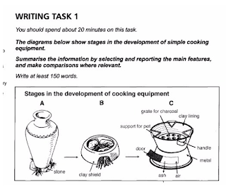
Sample Ielts Academic Writing Task 1 - The Diagrams below show stages in the development of simple cooking equipment. Summarize the information by selecting and reporting the main features, and make comparisons where relevant.

The Diagrams below show stages in the development of simple cooking equipment.
Summarize the information by selecting and reporting the main features, and make comparisons where relevant.
Write at least 150 words
The given diagrams elucidate stages in evolution of simple cooking apparatus.
 
The Diagrams below show stages in the development of simple cooking equipment. Summarize the information by selecting and reporting the main features, and make comparisons where relevant.
Ielts Writing Task 1 - 
The given diagrams elucidate stages in evolution of simple cooking apparatus in three stages.  

The primitive  design was very simple that made use of three stones arranged in a manner, triangular shape  to support the cooking vessel. The wood of fuel was simply lit under the vessel.

With the time, some improvements in the design were affected to make cooking easier. A clay shield was built around the three stones, and an opening was left for insertion of the fuel. As can be observed, this design aimed at protecting the fire, lit under the pot, from the winds. Rest of the design was almost similar.

The more advanced specimen, made of metal, used for cooking is completely different from its predecessors. This design has two portions, upper and lower chamber. While the upper chamber has a clay lining, handles to hold, three supports for the cooking pot, and a grate for holding charcoal, the lower part with a door is meant for inlet of air and disposal of ash.   


Wednesday, August 30, 2017

Sample Ielts Academic Writing Task 1 - The table below shows the results of surveys in 2000, 2005 and 2010 about one university

The table below shows the results of surveys in 2000, 2005 and 2010 about one university. Summarize the information by selecting and reporting the main features, and make comparisons where relevant.


Write at least 150 words
The table below shows the results of surveys in 2000, 2005 and 2010 about one university
Ielts Academic Writing Task 1 - The table below shows the results of surveys in 2000, 2005 and 2010 about one university

The table indicates changes in the attitudes of students towards various facilities at universities between 2000 and 2010.

Most striking observation is a significant rise in percentage of students rating about electronic resources in this period, it rose from 45% in 2000 to a whopping 88% in 2010, it was more steep in the first 5 years, touching 72% in 2005.

Similarly, there was an improvements in the opinions about teaching quality even though very limited, from  65 in 2000 to 69 ten years later though there was a slight decline in first 5 years.

In contrast, opinions about building and teaching facilities remained unchanged throughout the decade, 77%. Similarly,  although print resources, on an overall registered a one percent rise in positive views in the decade, it actually declined from 89% in 2005. But, still both these facilities continued to be overwhelmingly popular among the pupils.

However, range of modules offered registered a juicy decline of 5% in the 10 year period, it was steeper from 2005 to 2010.
    

Tuesday, August 29, 2017

Sample Ielts Academic Writing Task 1 - The Charts below show UK and USA energy consumption in 2000 and 2006 - II

The Charts below show UK and USA energy consumption in 2000 and 2006. Summarize the information by selecting and reporting the main features, and make comparisons where relevant.
Write at least 150 words

The Charts below show UK and USA energy consumption in 2000 and 2006

The given bar charts elucidate changes in energy consumption patterns in UK and the USA from 2000 to 2006.
It can be clearly observed that in 2000, pattern of reliance fuels for energy production in both the country was almost similar, as far as the reliance on various sources is concerned, though the percentage and amount varied a little. Both the countries heavily relied on oil and coal, the percentage of use of these materials was higher in the US, above 35% and 35% in comparison to above 25% and 30% respectively though gas atomic power and other renewable sources were used more in Britain.

From 2000 to 2006, the pattern of dependence on the fuels underwent a seas change. While UK shifted to use of gas, followed by oil - use of other renewable sources also saw a rise, in the USA oil continued to be widely used, followed by gas.

Quite notably use of coal decreased significantly, by approximately 10%. Similarly,  use of nuclear power also declined. 

Wednesday, April 12, 2017

Sample Ielts Academic Task 1 - The Chart and the table below show customer satisfaction levels in the US with airlines and aspects of air travel in 1999, 2000 and 2007.
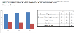
The Chart and the table below show customer satisfaction levels in the US with airlines and aspects of air travel in 1999, 2000 and 2007.
Summarize the information by selecting and reporting the main features, and make comparisons where relevant.
Sample ielts Acadeimic Writing Task 1

The given bar chart and table illustrate changes in the satisfaction level of airlines passengers in terms of various components in years 1999, 2000 and 2007.

The percentage of contended passengers in the quoted period registered an uninterrupted rise from 65% in 1999 to 72% in 2007 though the rise was drastic between 1999 and 2000, from 65% to 69%.

As far as various aspects of air travel was concerned, there was a rise in percentage of travelers who were happy with courtesy of flight attendants, touching 92% from 88% in corresponding period, and ticket pricing, significantly rising from 45% to 65%.

Almost similarly, a great percentage of people remained satisfied with the schedules of flights, rose from 75 to 79.   

A new component of air travel was also surveyed about in 2007, seat comfort, and 42% felt happy with this aspect.


However, in terms of services of check-in gate staff, lesser satisfaction levels were registered in 2007 in comparison to 2000, from 89 to 88%.

Friday, March 24, 2017

Sample Academic Writing Task 1 - The Table shows the numbers of visitors to Ashdown Museum during the year before and the year after it was refurbished.

The Table shows the numbers of visitors to Ashdown Museum during the year before and the year after it was refurbished. The charts show the result of surveys asking visitors how satisfied they were with their visit, during the same two periods.
Summarize the information by selecting and reporting the main features, and make comparisons where relevant.
Write at least 150 words
 
Ielts Sample Academic Writing Task 1 - Pie charts 
The given table and pie charts inform, and compare changes in number of visitors and opinions of visitors about Ashdown Museum before and after renovation.

The number of people paying visit to the museum rose substantially, from 74000 to 92000 within a matter of a year of renovation. It can be observed that there was a great change in the views people held about Ashdown.

A majority of people seemed to be dissatisfied, or dissatisfied with the museum, 55%.

The swings in opinions registered a significant transformation within 12 months of renovation. An overwhelming number of people visiting Ashdown seemed content, or very happy, percentage of content and extremely happy visitors rose by 10% in both cases, rising to 40% and 30% respectively.

Quite contrary to that, there was a staggering fall in the proportion of discontented people by a good 30%, from 40% to 15% and  highly discontented by half, from 10% to 5%.


There was no change in the ratio of visiting individuals choosing not to respond.

Friday, March 17, 2017

Sample Academic Writing Task 1 - The Graph and the table show the average monthly temperatures and annual hours of sunshine received by three major cities. Summarize the information by selecting and reporting the main features and make comparisons where relevant.

The Graph and the table show the average monthly temperatures and annual hours of sunshine received by three major cities.
Summarize the information by selecting and reporting the main features and make comparisons where relevant.
Write at least 150 words

The given graph and table compares average monthly temperature patterns of London, New York and Sydney, and the amount of sunshine received by these cities.

It can be observed clearly that London and New York have somewhat identical patterns of rise and fall of temperature annually. The temperatures in these cities tend to rise as the year advances and after the mid year, it becomes colder towards December though the variation in rise and fall in temperature in New York, from 5° to 30° and back, is more than London, where the change is more moderate, from 10° to 25° and back.

In contrast, Sydney experiences an inversely proportional, but a moderate trend. The temperatures tend to be higher in January 26°, and cooler, 15°, in July and again warm in December; the variations are moderate like London.


New York and Sydney receive almost similar amount of sunlight in a year while London received less than half of former cities despite New York receiving highest 2535 hours, and Sydney, 2473 hours.

Monday, March 13, 2017

Sample Academic Writing Task 1 - The graph below shows average carbon dioxide (CO2) emissions per person in the United Kingdom, Sweden, Italy and Portugal between 1967 and 2007. Ielts

The graph below shows average carbon dioxide (CO2) emissions per person in the United Kingdom, Sweden, Italy and Portugal between 1967 and 2007. 

Summarize the information by selecting and reporting the main features, and make comparisons where relevant.
Writ at least 150 words.

carbon dioxide (CO2) emissions
Ielts Academic Writing task 1 

The given graph illustrates changes in the annual per capita CO2 emissions in four countries between 1967 and 2007.

It can be observed that CO2emissions per person in Great Britain were highest in the 4 decades even though a fall of almost 4%, from approximately 11% to approximately 7%, was recorded in the quoted period.

Similarly, Sweden also registered a fall in the corresponding period, from around 9% to 5% , though it initially saw a spike of around 1.5% from 1967 to 1977. From 1977 onwards, the decline in emissions was drastic, and Sweden was surpassed by Italy in 1987. In 2007, carbon emission of this country was at par with Portugal.

On the other hand, Italy and Portugal witnessed a rise in the carbon discharge in the corresponding time frame. The pattern of rise in both the countries was almost identical even though the difference in emissions was more than 2% between Italy, above 4%, and Portugal, 1%.

The rise was constant in both the nations.


Tuesday, December 27, 2016

Sample Ielts Academic Writing Task 1 - Graphs The Bar Chart below gives information about the percentage of the population living in urban areas in the whole world and in different parts of the world

The Bar Chart below gives information about the percentage of the population living in urban areas in the whole world and in different parts of the world.
Summarize the information by selecting and reporting the main features, and make comparisons where relevant.
Write at least 150 words

Ielts Academic - Graphs Urbanized Population 

The given bar chart illustrates trends of urbanization of population across the globe, and specifically in five regions.

Less than 1/3rd world population was in urban areas in 50’s, which almost doubled in 2007. But, the speed of urbanization is expected to slow down in next decade.

In 1950’s, more than half of population in North America, 64%, and Europe,51%, was urbanized, while in 42% Latin Americans lived in urbanized locations. Asia and Africa had less than 1/5th of population in urban centers, 17% and 15% respectively.

By 2015, urbanized population almost doubled in Latin America, 78%, Asia, 41%, and Africa – 37%. Quite strikingly, Europe, North and Latin Americas found 3/4th of population in urban centers, less than 50% Asian and Africans chose to live in cities.

By 2030, close to 90% of population – North American,87%, Latin Americans, 84% - would be living in urban surroundings, while a little more than 3 quarters, 78%,  Europeans would be urbanized. In Asia and Africa though only half of population would be urbanized. 


Tuesday, December 20, 2016

Sample Ielts Academic Writing Task 1 - The diagrams below show the development of a small fishing village and its surrounding area intoa large European tourist resort.

The diagrams below show the development of a small fishing village and its surrounding area  intoa large European tourist resort.
Summarize the information by selecting and reporting the main features, and make comparisons where relevant.
 
Ielts Academic Writing task 1 - Coastal Village 
The given diagrams depict the changes in a coastal village after its development into a big European tourist resort, between 1974 and 2004.

It can be easily observed that the fishing village and surrounding areas underwent a sea change in a matter of 3 decades. The population of this area rose from 12000 to 80,000, and it swells to 130,000 during the tourist season.

The village itself witnessed an expansion, as construction of new tourist shops was done to cater to the tourists. Besides this, what used to be a harbor in 1974 gave way to beaches. The beaches are now lined up by high rise hotels that cover most of the coastline, and also surround the fishing village.

The natural woodlands and olive orchids were also replaced by golf course, for tourists, and farmlands, that feed the travelers, respectively. The pastures also disappeared.

A road was also constructed to connect this region with other parts of the world, and this runs from the beach and through the village. 


Sunday, October 30, 2016

Sample Ielts Academic Writing Task 1 - Bar Graphs

The Graphs below show the figures for population distribution in the northwest for 1900-2050. Summarize the information by selecting and reporting the main features, and make comparisons where relevant.
Ielts Academic Writing Task 1

The given graphs illustrate changes in number of inhabitants residing in rural, urban and suburban areas between years 1900 to 2050 in the Northwest.

The population in rural areas declined in the last century by almost 45 million, from approximately 65 million in 1990 to 20 million in 2000. The figures for the first half of the 21st century, till 2050, suggest that the population in regional areas may further decline to 10 million.

However, the trends of population living in sub-urban areas indicate a completely reverse trend. At the start of 20th century 10 million people were residing in sub-urban areas. It doubled up twice in 100 years, to 20 millions in 1950 and 40 millions in 2000. In 2000 an equal number of people were living in urban and suburban areas. The population in next 50 years is expected to reach almost 60 millions.


In contrast, population registered a gradual rise in urban areas in last century – from 1900 to 2000, but is expected to decline in next 5 decades.

Thursday, August 25, 2016

Sample Ielts Acade,ic Writing Task 1 - The table below shows the results of a survey to find out what members of a city sports club think about the club’s

The table below shows the redults of a survey to find out what members of a city sports club think about the club’s activites, facilities and opening hours.
Summarize the information by selcting and repoting the main features, and make any comparisions where relevant.
Write at least 150 words


The given table illustrates the outcomes of a survey carried out to gauge the satisfaction levels of the members of a club, in relation to various services and facilities offered by the club.

It can be clearly observed that an overwhelming number of men (95%) were happy (55% very happy and 40% happy) with the range of activities offered at the club, while 30% were not content – 70% reported that they were happy with the range of activities provided.

On the other hand, a majority of females (97% total 72% very happy and 25% happy) were pleased with the opening hours of the club, whereas one thirds of men expressed reservations – only two thirds of the men found the opening times of the clubs satisfactory.

One aspect where the male (86%) and female members (89%) members seemed to agree was the club facilities, and only 14% males and 10% females expressed dissatisfaction over this issue.

Overall, more males favored range of activities while women liked opening hours of the club.


Sunday, August 21, 2016

Ielts Academic Writing Task 1 - Use of Energy in American Households and Green House Gas Emissions

The first chart below shows how energy is used in an average American household. The second chart below shows the greenhouse gas emissions resulting  from energy use. Summarize the information below by selecting and reporting main features, and make relevant comparisons where relevant.
Write at least 150 words
 
Ielts Academic Task 1 - Use of Energy in American Households 
The given charts discuss the proportionate usage of energy in American households, for various purposes, and greenhouse gases released due to use of energy.

It is clearly observed that most of power (72% cumulatively) is consumed by Americans for heating (42%) and water heating (30%). Both of these activities combined generate less that 50% green house emissions (32% is attributed to water heating and 15% to heating).

Similarly, the amount of power consumed for cooling is barely 2%, while percentage of gases released amount to a marginal 3%.

On the other hand, equipment used for refrigeration and lighting, and other appliances use 7%, 4% and 2%, and 15% respectively – 50% cumulatively. The use of power in these activities and appliances result in a high percentage of release of green house gases, in case of refrigeration and lighting the percentage of green house gases is double, 14% and 8% respectively, of energy used. The gases emitted by other appliances are also almost double the amount of power used.  


Monday, August 8, 2016

Ielts Academic Writing task 1 -The bar graph shows the net worth (in million Euros) of various sectors in UK between 2005 and 2014.

The bar graph shows the net worth (in million Euros) of various sectors in UK between 2005 and 2014. Summarize the information for the lecturer of university by quoting important information. Write at least 150 words.

The given graph shows changes in the net worth (in million Euros) of various sectors in UK between 2005 and 2014, namely household, government, businesses and UK as a whole.

The net worth of domestic sector remained steady between 2005 and 2007, and registered a rise to over 6000   in 2011(from 4500). The figures of UK as a total indicated at a similar trend in corresponding period – rising from   4000   to   6000.

Both the household and UK total worth continued with an almost identical trend while substantially dipping by almost 500   (5200 and  5500 respectively) in 2012.

While the net worth of household registered a rise in 2013 and further rose to   6000   in 2014, the UK’s total worth further dipped in 2013 to   5200 and finally rising to 6000  .  

The net worth of the government registered a steady overall rise in the quoted period.

The net worth of business witnessed negative trends even though the situation improving a little in 2014, but not before experiencing decline in 2010.


Wednesday, June 15, 2016

Ielts Writing task 1 Sample Task - Functioning of a solar power water pump

Write a summary on the functioning of a solar power water pump in at least 150 words.  
Ielts Writing Task 1 - Solar Water Pump 

The given diagram depicts the function of a solar power water pump

The solar power water pumps uses solar energy which is produced by photovoltaic cells installed in the solar panel. There cells use energy of the sun derived from the sun rays.

The solar panels generate direct current power which is supplied to the bore pump underground. The bore pump is install and submerged in the water in the underground boring which is also known as bore well. When the bore pump is operated with the help of electricity generated by solar panels it pumps up water from the underground resources.

The water pumps from the natural underground reservoirs of water can be stored in the water tank. This water drawn from the underground reservoir can be put to use by the people of village as per requirement.

The process of drawing water from the underground reservoir is very simple, non polluting as an energy efficient system and can proved to be quite cost effective in the long run. 

Friday, September 25, 2015

The Graph below shows the working hours for men and women in developing world between years 1998 to 2003 - Ielts Academic Task 1

The Graph below shows the working hours for men and women in developing
world between years 1998 to 2003. Summarize the information by selecting and reporting the main features, and make comparisons wherever necessary.
Write at least 150 words 

Ielts Academic Writing Task 1 

The given graph depicts number of hours spent at work by men and women in 8 underdeveloped nations between 1998-2003. 
The average working hours of nationals of each mentioned country is just above 6 hours. In Mongolia, workers of both the genders spent more time than workers of  other country (more than 8 hours); they were followed by Indians; Mexicans; workers of Madagascar; North Korea; and Mauritians respectively, who spent a little above 6 hours. Workers of Benin and South Africa spent between 4 to 6 hours at work.
Similarly, average extra time spent by women workers of these countries was 1 hours and 9 minutes. Women in Benin spent did most over time than (145 minutes). They were followed by Mexicans (105minutes), Indians (65 minutes), South Africans (59 minutes), women of Madagascar (51 minutes), Mongolians (24 minutes) and Mauritians (24 minutes).

To conclude, most time spent at work by both genders was in Mongolia while extra hours spent by Mexican women was more than women of other countries.

Friday, September 11, 2015

The Table below shows the results of a survey that asked 6800 Scottish adults - Ielts Academic Writing Task 1

The Table below shows the results of a survey that asked 6800 Scottish adults (aged 16 years and over) whether they had taken part in different cultural activities in the past 12 months.

Summarise the information by selecting and reporting the main features, and make comparisons where relevant.
Write at least 150 words.
Ielts Academic Writing Task 1


Participation in cultural activities, by age
16-24
25-44
45-74
All aged 16 and over

%
%
%
%
Any performance*
35
22
17
22
Undertaking any crafts
11
17
22
19
Cultural purchases
11
17
18
16
Any visual arts
30
16
11
15
Any writing
17
6
5
7
Computer based
10
9
5
6
* Dancing, singing, playing musical instruments and acting


The given table depicts the age wise details of participation by 6800 Scottish adults in an array of cultural activities.
The table shows that most of participants aged between 16-24 took part in any performance (35%) - dancing, singing, playing musical instruments and acting –; while least number of people participated in computer based activities (10%).

Similarly, most participants in 25-44 age group took part in any performance (22%), whereas only 6% went for any writing activity.

Most of people aged with 45-74 years participated in Undertaking any crafts while only 5% went for any writing and computer based activities each.

In an overall, all participants aged 16 and above took part in any performance (22%) while least number of people participated in computer based activities (6%).

To sum up the assessment, most of the participants seemed to be more inclined to any activity – closely followed by undertaking any crafts; cultural purchases; any visual arts; any writing, whilst least number of participants seemed inclined to computer based activities.


Tuesday, August 11, 2015

Chorleywood is a village near London whose population has increased steadily since the middle of the nineteenth century. The map below shows the development of the village.

Write a report for a university lecturer describing the development of the village.
Ielts Academic Writing Task 1 - Chorleywood Village 

The given map depicts development – in terms of increase of population – of Chorleywood Village near London between 1868 and 1994.

The Chorleywood area had two main roads – running from south to north and North-west to east around Chorleywood Park and golf course. First settlements came up east of the main road and south west of gold course between1868 - 1883.

There was a subsequent expansion of residential areas just south of first settlement from 1883 to 1922. In the meanwhile, a railway line – running across the second settlement with a station in the area; and running from west to east – was laid in 1909.
This led to further settlements (1922-1970) along the railways lines – in the east and west of second settlement.

Construction of motorway in 1970 – running from south to north and intersecting railway lines and the main road led to development of fourth phase of settlements – that came up around motorway and railway lines.
The major development of Chorleywood took place after development of railways and motorway. 

Tuesday, July 21, 2015

The charts below show the result of a survey of adult education. The first chart shows the reason why adults decide to study.

The charts below show the result of a survey of adult education. The first chart shows the reason why adults decide to study. The pie chart shows how people think the costs of adult education should be shared.
Write a report for a university lecturer, describing the information shown below
Ielts Writing Task 1 _ Adult education 


The given charts depict the outcome of the survey conducted on adult education. The bar chart shows reasons, why adult pursue education whereas the pie chart shows what people feel about sharing of cost incurred on education.

The reason why adult pursue education can broadly categorized as professional and non- professional 40% of the adults pursued education due to interest towards specific subject followed by 20%enjoying gaining more knowledge and 9% willing to increase their circle.

On the other hand, 38% repentance wanted to gain qualifications; 22%wanted qualification to help them in current employment! 20%adults grownups wish to enhance of promotion and 12%wanted to switch job.

On the issue of the cost sharing , people felt that the major burden of education fees (40%) should be borne by individual seeking collage addmition!30% should be contributed by employer !The balance 25%should be funded from Taxpayer.


It conclude that most of adults pursue education because of professional reason and people feel that burden of fees should be divided in three parts

Tuesday, June 9, 2015

Ielts Writing Task 1 - coin operated photo booth

The Picture below shows an automatic photo booth.
Summarise the information by selecting and reporting the main features and make comparisons where relevant. Write at least 150 words

The given diagram depicts the way a self-service coin operated photo booth works.

To start the process, the interested customers need to insert coins of required denomination in the coin slot; and select the type of picture required by them, i.e. the booth can deliver one large format or 4 passport sized pictures. Furthermore, the customers need to select whether they pictures in color or black and white –it is recommended that passport size photos should be in color.

After that clients move in; pull the curtains; and make adjustments in their appearance by using mirror in the booth. The clients need to sit on adjustable stool provided inside the booth. The clients need to adjust height of the stool so that their eyes are at the indicated level. A light above the camera panel tells the clients to be prepared, and after 3 seconds the flash light goes off. The photographs, as required, are delivered within 60 seconds.

Automated photo booth  is fast and convenient way of taking pictures.