Search This Blog

Showing posts with label Ielts academic writing 1 Graphs. Show all posts

Wednesday, December 23, 2020

Ielts Academic Writing Task 1 Graphs The chart below shows information about changes in average house prices in five different cities


The chart below shows information about changes in average house prices in five different cities between 1990 and 2002 compared with average house prices in 1989.

Summarize the information by selecting and reporting the main features, and  make comparison where relevant.

Write at least 150 words

The chart below shows information about changes in average house prices in five different cities between 1990 and 2002 compared with average house prices in 1989


The given bar chart illustrates changes in the average prices of dwelling units between 1990 and 2002 based on the average prices of 1989.

Overall, the average mean prices of housing registered to the large fluctuations in London and New York while in Madrid, Tokyo and Frankfurt they remained largely in the same pattern.

In the period from 1990 to 1995 the prices of residential units in London and Tokyo registered the steepest fall of approximately -7%. This was followed by New York, -5%  in comparison to 1989 prices. However, Frankfurt and Madrid recorded a rise of nearly 3% and 2% respectively. 

Quite interestingly, in the period of 1996-2002 radical variations were witnessed in the case of London and New York where a dramatic rise of almost 11% and 5% respectively, was registered in relation to 1989. In contrast, in Tokyo the prices were 5% lesser in comparison to 1989 while Madrid and Frankfurt had almost 4% and 2% higher prices than the base year. 


Monday, November 9, 2020

Ielts Academic Writing Task 1 The graphs below shows the quantities of goods transported in the UK between 1974 and 2002 by four different modes of transport


The graphs below shows the quantities of goods transported in the  UK between 1974 and  2002 by four different modes of transport.

Summarize the information by selecting and reporting the main features, and make comparisons where relevant.

The graphs below shows the quantities of goods transported in the  UK between 1974 and  2002 by four different modes of transport


The graph illustrates the changes in  quantities of the goods transported, in the UK between the year 1974 and 2002 through four different modes of transportation.

Overall, most of the goods were transported by road in the UK throughout the 1974-2002 period, and it witnessed a rise. Transportation by water and  pipeline also witnessed a rise, but rail experienced fluctuations.

In 1974, the amount of goods  hauled by road in 1974 was nearly 70 millions tonnes,  the tonnage rose in subsequent years, reaching almost 100 million tonnes. Similarly, haulage of cargo by water also witnessed a rise in the given period, increasing from nearly 40 million tonnes to approximately 65 millions tonnes after surpassing railways and staying constant for 15 years. Furthermore, movement of goods by pipeline was almost 5  million tonnes in 1974 and reached over 20 in 1994, and stabilized.

However, railways experienced fluctuations, cargo haulage declined from 40 to almost 20 million tonnes in 1994 and rose back to 40 from 1994 to 2002.


Saturday, April 25, 2020

Ielts Academic Writing Task 1 The Graphs below show the number of men and women in full and part-time employment in Australia between 1973 and 1993.

The Graphs below show the number of men and women in full and part-time employment in Australia between 1973 and 1993.

Summarize the information by selecting and reporting the main features, and make comparisons where relevant

Write at least 150 words.
The Graphs below show the number of men and women in full and part-time employment in Australia between 1973 and 1993.
Ielts Writing Task 1 - Graphs 

The given graphs elucidate and compare employment patterns among males and females in full and part time work between 1973 and 1993 in Australia 

Overall, the patterns of employment among full time men and women workers are different, where number males working full-time declined between 1973 and 1993, more women found employment in such jobs. But, in the case of part time work, employment fell both in men and women in the given period. . 

Full-time employment  among males declined in the 20 year period though there was hardly any noticeable change in age-wise employment figures. Most men between 25-59 worked full time, whereas, employment among women in such jobs increased though age based fluctuation continued as it is - most women aged between 19 and 25 found jobs in such arrangement. .  

In contrast, in case of part-time work, these kinds of jobs become unpopular among both genders even though most males working in such arrangements were in the youngest age group, and the youngest and 35-39 among the females  


Wednesday, October 30, 2019

Ielts Academic Writing Task 1 Line Graph Below is the graph showing the incidence of mental illness


Below is the graph showing the incidence of mental illness (as indicated by receipt of incapacity Benefit) among older UK males, from 1971-2015. The reform in the benefits system took place in 1995.

Summarize the information by selecting main features and making comparisons where relevant.

Write at least 150 words
Below is the graph showing the incidence of mental illness
IELTS WRITING TASK 1 LINE GRAPH 


The given graph elucidates changes in incidence of incapacity benefits, in three age groups,  between 1971 and 1995 and after introduction of reforms in 1995 up  to 2015.

Quite notably, there was a great reduction of impairment grants after reforms in all age groups. The greatest change was witnessed in age group 65-69, while people aged between 60-64 remained biggest recipients throughout the period.

Prior to reforms in 1995, there was a surge in incapacity grants in age group  60-64 years, from almost 7% to nearly 28% between 1971-1985, while in 55-59 it rose more steadily in this period, from approximately 6% to almost 18% though between 1985 and 1995 it rose more quickly. In contrast, grant of benefits experienced  fluctuations in this period, rising from 3% to 17%.

However, after incorporation of reforms, the where the grants plummeted to almost 1% in 65-69, rising a little thereafter, and declined steadily in 55-59, reaching 12%, fall in 60-64 witnessed fluctuations before touching almost 16%.

Thursday, August 22, 2019

Academic Writing Task 1 - graphs The Graph below shows the number of passenger railways journeys made in Great Britain


The Graph below shows the number of passenger railways journeys made in Great Britain between 1950 and 2005.
Summarize the information by selecting and rpoeting the main features, and make comparisonbs where relevant.
Write at least 150 words


 Number of passenger railways journeys made in Great Britain
IELTS WRITING TASK 1  number of passenger railways journeys made in Great Britain 


The present line graph highlights and compares changes in passenger traffic in three rail networks in Britain from 1950 and 2004/05

Quite strikingly, national rail network and London underground witnessed nearly similar pattern while number of passenger railway journeys made on light rail and metro station had a contrasting pattern.

In 1950 the number of passengers using national rail network was 1000 and London underground was approximately 745 million. From 1950 to 1975 while the former experience an initial rise to almost 1100 million and then consistently fell the traffic on the later remained constant . However , after that both the networks experienced a dip touching 745 million and 500 million respectively .

Post this period there was a rise in number of annual passengers on both the networks after surpassing each other several times London underground crossed 1000 million mark . In national rail network touched almost these numbers .

However , the growth in third network was unremarkable from approximately 100 million to 200 million from 1962 to 2004/5


Friday, April 12, 2019

Ielts Academic Writing Task 1 Graphs The Graphs below provide information on global population figures and figures for urban populations in different world regions


The Graphs below provide information on global population figures and figures for urban populations in different world regions.
Summarize the information by selection and reporting the main features, and make comparisons where relevant.
Write at least 150 words

 
The Graphs below provide information on global population figures and figures for urban populations in different world regions
IELTS Writing Task 1 Graph 

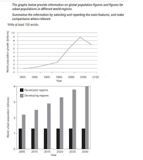
The given line chart and bar graphs elucidate the rise in global population between 1800- 2000 and projections till 2100, and changes in urban population in developed and developing regions from 2000 to 2030 respectively. 

Overall, the world population is expected to grow phenomenally till 2050, but decline in next five decades. urban population in developing regions would consistently rise till 2030 while in developed regions it would stay constant.

The population of the world rose negligibly approximately from 1 billion to nearly 2.5 billion from 1800 to 1950. However, it rose two folds in the later half of the twentieth century, and is expected to continue rising till 2050 and touch almost 9 billion though the next half of the twenty first century a decline is expected with the population falling to 7billion.


Moving further, the urbanized population in developed regions is expected to stay constant at 1.25 billion till 2030. Whereas, in developing regions a constant rise is expected from 2.25 billion in 2005 to 4 billion in 2030.

Sunday, March 24, 2019

Ielts Academic Writing Task 1 The Chart below shows the types of film preferred by different age groups at one cinemaI


The Chart below shows the types of film preferred by different age groups at one cinema.
Summarize the information by selecting and reporting the main features, and make comparisons where relevant.
Write At least 150 words.
The Chart below shows the types of film preferred by different age groups at one cinema
Ielts Academic Writing Task 1 Movie Genres 

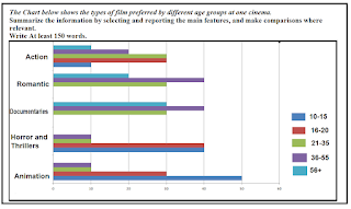
The given bar chart elucidates and compares preferences of movie viewers as per age group, in terms of five genres of movie. 

Overall, the youngest age group, 10-15, like animation most; viewers in 16-20 and 21-35;  prefer to watch every genre of movies; viewers aged between in 36 and 55 love documentaries and romantic though they watch every genre; and viewers aged above 56 prefer documentaries. Besides this, action movies are watched by all groups

Majority of children, 50% like animations, followed by horror and thrillers, 40% and action, 10%.  Viewers between 16-20, mostly go for horror and thrillers, 40%,  while 30% prefer animation and action.

Individuals in age groups 21 to 35 and 36 to 55 like every genre. Where the former group finds documentaries,  romantic and action most engrossing, the latter group loves the first two genre of former group, 40% each

People aged above 56 years were most into documentaries, 30%, followed by romantic flicks, 20% and action, 10%.

Monday, November 19, 2018

Ielts Academic Writing Task 1 Line Graph Railway Usage in Great Britain


The Graph below shows the number of passenger railways journeys made in Great Britain between 1950 and 2005.
Summarize the information by selecting and rpoeting the main features, and make comparisonbs where relevant.
Write at least 150 words

The Graph below shows the number of passenger railways journeys made in Great Britain between 1950 and 2005
Ielts Academic Task 1  Line Graph  Great Britain Railway Usage 

The given line chart elucidates and compares usage patterns of three rail networks in Great Britain between 1950 and 2004/5.
Quite strikingly, the pattern of journeys made by National Rail Network and London Underground had comparable patterns, while light rail and metro systems registered a slow rise in passenger traffic in the corresponding period.
In 1950, 1000 million people used National rail networks, while just under 750 millions used London Underground. Between 1950 and 1980 both networks witnessed a fall, though the decline in passengers using national networks was steeper. But, after 1980, both the systems registered a recovery in passenger traffic till 2004 / 05 – the number of passengers using London Underground surpassed national network, breaching 1000 million mark, with national networks reaching almost the 1950 numbers.  
In contrast, light rail and metros were introduced between 1960 and 1970. Until 1980, there was not much increment, instead a decline was observed, however, from 1980 to 2005, an expansion in passenger traffic was observed, reaching almost 200 million.

Monday, July 23, 2018

Ielts Academic Writing Task 1 Ielts Graphs


The first graph below shows the weight (in tones) of fruit produced by a farm during each month in 2010, use of fertilizers, and the amount of rainfall, in millimeters, in each month.

Write a report summarizing the information. Select and describe the main  information and make comparisons where relevant.
Write at least 150 words.

 
The first graph below shows the weight (in tones) of fruit produced by a farm during each month in 2010, use of fertilizers
Ielts Academic Writing Task 1 Graphs 
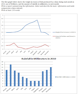
The given graphs compare fruit produced, fertilizers used and amount of rainfall, in a farm in 2010

Overall, trends of yield of fruits are inversely proportional to use of fertilizers and amount of rainfall – yield of fruit was high when use of fertilizers and rainfall was low.

In January, the harvest of fruit was 2.5 tone and stayed stable till April. After this, the yield rose dramatically and touched a peak of  almost 4.5 tonnes in September. From there on the yield declined to levels of January though the decline was more remarkable in the month of October.

While, the use of fertilizers rose from .5 tonnes to almost 1 tonne and declined to nearly zero in June , but from July to   November it rose, touching the peak in November, 0.7 tonnes and declining again. The rainfall seems to coincide with the fertilizer, falling from a high of 16 mm in January to 4mm in July and then rising to 14 mm in December.   


Tuesday, July 17, 2018

Ielts Academic Writing Task 1 The graphs below show the types of music albums purchased by different groups of people in Britain according to sex and age.


The graphs below show the types of music albums purchased by different groups of people in Britain according to sex and age.
Write a report for a university professor by describing the information shown below.
Write at least 150 words.   
The graphs below show the types of music albums purchased by different groups of people
Ielts Academic Writing Task 1 


The given bar graph elucidates the preferences of men and women and different age groups in terms of genre of music.

Overall, it can be observed that more men than women buy all kinds of music, and younger age groups  prefer pop and rock, while people aged over 45 years like classical music.

As far as, the gender based preferences us concerned, both males and  females, over 20% and 15% respectively, prefer pop and rock over classical, under 10% in both the sexes.

Age-wise preferences of music genre show that in case of pop and rock, buying preferences are almost identical: people aged between 25-34 years are dominating customers, 30% buying both pop and rock, followed by individuals between 16-24 years, 15%, and older than 45 years, less than 10%.
On the other hand, classical music is most preferred by people aged over 45 years, approximately 20%. Negligible numbers in other age groups prefer this type – though 15% people between 25 and 34 years buy this type too.

Saturday, June 2, 2018

Ielts Academic Writing Task 1 Graphs The Graph shows the percentage of male and female academic staff members across the faculties of a major university in 2015Iel


The Graph shows the percentage of male and female academic staff members across the faculties of a major university in 2015.
Summarize the information and selecting and reporting the main features, and make comparisons were relevant.
Write at least 150 words
The Graph shows the percentage of male and female academic staff members across the faculties of a major university in 2015
Ielts Academic Writing Task 1 Graphs 

The given graphs presents and compares the information on gender wise representation in different departments, namely Engineering, Law, Education, Science of a university in 2015
.

Overall, while engineering department had an overwhelming presence of men, women  dominated education faculty.  Other faculties had still fairer compositions, especially the department  of medicine.

Quite interestingly, engineering had 85% males with only 15% women teaching in this domain. Other departments that saw more men teaching were Science and Business, which had similar proportion of male teachers, 65%, and Law had a   slightly lesser but a majority of men – 60%.

On the other hand, female lecturers dominated education, 75%, with men only constituting one-fourth of total strength. Arts also had a major  of females, constituting 55% of the total faculty. 

Quite in a contrast, the department of medicine was more evenly distributed with females having just a slight edge over the men. In this faulty, female teachers were just above 50%, and the men just below 50%.   

Wednesday, May 30, 2018

Ielts Academic Writing Task 1 Graphs The charts below give information about USA marriages and divorces rates between 1970 and 2000I


The charts below give information about USA marriages and divorces rates between 1970 and 2000, and the marital statis of adult americans in two of the years.
Summarize the informartion by selecting and reporting the main features, and make comparisons where relevant.
The charts below give information about USA marriages and divorces rates between 1970 and 2000
Ielts Writing Task 1 Graphs - Marriages and Divorces 
Write at least 150 words

The given charts elucidate information about number of marriages and divorces in the USA and changes in marital status between 1970-2000.

Overall, numbers of marriages fell in the given period though between 1970-1980, while te number of divorce cases initially increased then declined. The marital status also witnessed changes.

From 1970 to 1980 the number of marriages stayed stable at 2.5 millions, while legal separations registered a rise from 1 million to  nearly 1.4 million. From 1980 to 2000 marriages lesser and lesser American married – numbers fell from 2.5 to 2 million, similarly lesser numbers sought divorces – numbers fell to 1 million.

As far as the changes in marital status of adult Americans is concerned, there was a rise in number of people choosing to stay unmarried, from  12% to 20% , and getting a divorce, from nearly 2% to 10%. There was, however,  a 10% decline in the ratio of people getting married, fell from 70% to 60%, and a marginal decrease in widowed people, approximately 8% to 6%.  


Wednesday, May 9, 2018

Sample Ielts Academic Writing Task 1 - Graphs The Graph below shows the percentage of urban/sub-urban and rural households in the UK having internet access between 1999-2004

The Graph below shows the percentage of urban/sub-urban and rural households in the UK having internet access between 1999-2004
Summarize the information by selecting and reporting the main features, and make comparisons where relevant.
Write at least 150 words
The Graph below shows the percentage of urban/sub-urban and rural households in the UK having internet access between 1999-2004
Ielts Academic Writing Task 1 - Graph INternet Usage in the UK 

The given graph elucidates information about access to internet enjoyed by domestic users in urban-suburban and rural areas in the UK between 1999 and 2001

Overall,  although internet was accessed more by households in cities and suburbs than in rural areas, the gap narrowed  down by 2004. The difference, however, tended to expand between 2000 and 2002.

In 1999 the usage of internet in urban and suburban areas was almost 15%  which doubled up by 2000, 30%. From 2000 to 2002, the usage registered a steady rise of 20%, 10% each year. However, the growth in usage slowed down over the next two years, registering just 5% between 2002 and 2004.


In contrast, in rural areas the  use of internet in regional areas was slow to pick-up rising just  to 10% in 2001 from 1% in 1999, but in the next year the usage rose by 5%, touching nearly 15% in 2002. In the next two years – from 2002 to 2004, the use increased by 20%, 10% each year. 

Thursday, May 3, 2018

Sample Ielts Academic Writing Task 1 - Stacked Bar Chart One Hundred adults, boys and girls in a city were asked to name the sports they participated in. The outcomes were recorded in a stacked bar chart


One Hundred adults, boys and girls in a city were asked to name the sports they participated in. The outcomes were recorded in a stacked bar chart.
Write a report for university professor elaborating the preferences. Make comparison where relevant.
Write in no more than 150 words. 
One Hundred adults, boys and girls in a city were asked to name the sports they participated in. The outcomes were recorded in a stacked bar chart
Ielts Academic Writing Task 1 - Graphs 


The given stacked chart elucidates the responses of 100 respondents, adults, girls and boys, who were surveyed to assess their favorite sports in a city.

On an overall, adults had least participation in all sports except in swimming and tennis, while boys favored football more, and girls liked hockey. Also, boys featured in most of the sports prominently.

It can be observed that swimming was the most popular activity in this city: the boys and girls had equal participation, while the adults were slight lesser in number though this was the second most favorite activity among adults. Similarly, tennis – the second most popular activity besides hockey, had equal representation of  all categories of respondents, this was also the most favorite sport practiced by adults.

In contrast, football and basketball were more popular among boys than girls, especially in football, the participation of girls was negligible.

However, in case of hockey, most of the participants were girls, an overwhelming number.  

Monday, April 23, 2018

Sample Ielts Academic Writing Task 1 - Levels of participation in education and science in developing and industrialized countries in 1980 and 1990


The Charts below show the levels of participation in education and science in developing and industrialized countries in 1980 and 1990.
Write a report for a university professor describing the information shown below


Levels of participation in education and science in developing and industrialized countries in 1980 and 1990
Ielts Writing Task Academic 1-  Graphs 

The given charts elucidate dissimilarity between elite and poor nations in terms of education and science and technology development.

Quite strikingly, there is a big difference between  developed and under-developed  countries, and the gap actually widened.

In case of schooling, in 1980s, the number of years spent at schools was almost 8.5 years, while in poor nations it was two years. In the next decade, the length of schooling in rich countries rose by another two years, while in developing nations there was a negligible rise,

Similarly, the number technicians and scientists rose significantly in the quoted period in rich countries, from just above  40 to approximately 70 per thousand, but in under-developed nations, there was a small rise in numbers from 10 to 18 per thousand.

However, investments in research and development, the trends were quite dissimilar, as  even though the participation in  R&D rose by two-folds in rich countries, from 150 to 300 billion, in poor countries there was a drop from 50 to 25 billion.  


Tuesday, April 3, 2018

Sample Ielts Academic Writing Task 1 - The chart below shows the amount of leisure time enjoyed by men and women of different employment status


The chart below shows the amount of leisure time enjoyed by men and women of different employment status.
Write a report for a university lecturer describing the information shown below.

You should write at least 150 words
The chart below shows the amount of leisure time enjoyed by men and women of different employment status
Sample Ielts Academic Writing Task 1 - Graph

The given bar graph elucidates amount of time spent on leisure by men and women in different categories: employed full-time, working part time, jobless, retired and housewives, per week in 1998-99.

It can be clearly observed that  retired and jobless males, over 80 hours, and females, over 70 hours, spent most time on free time activities, and the least was devoted by ones working full-time, men 50 hours and women approximately 38 hours.

Similarly, housewives gave leisure activities almost 60 hours in a week, followed by women engaged in part time jobs: 40 hours.

Quite strikingly, it is noticed that where information about men and women, spending their time on free time activities, is shared, men tended to dedicate more than their female counterparts even though women choosing to remain at home as homemakers expended more time, per week, than males engaged in full-time work.

In conclusion, the variation in number of hours spent per week, in case of men, is not as great as in the women.


Sunday, March 25, 2018

Sample Ielts Academic Writing Task 1 - The bar chart below shows the average number of hours that women in various age groups and women with varying levele of educations spend on primary activities each week Explanation III


The bar chart below shows the average number of hours that women in various age groups and women with varying levels of educations spend on primary activities each week.
Summarize the information by selecting and reporting the main features, and make comparisons where relevant.
Write at least 150 words
The bar chart below shows the average number of hours that women in various age groups and women with varying levele of educations spend on primary activities each week
Ielts Academic Writing 1 Graphs - Women Spending Their Time on Different Activities 

Explanation III

The graphs highlight the amount of time devoted by women of different ages and education to various activities: leisure and sport, household, and work and work related, in a week.

It can be clearly observed that time dedicated to the leisure and sports tend to fall as the age increases and the educational levels rise to a particular level; individuals between 16-19 spend 36.8 hours on an average. The time given to this activity decreases as women become older and gain higher qualifications, but after 45 years the ratio increases and touches 51.7 hours - women 75 years or older.

In contrast,  time devoted to work and household rise with age and level of education, reaching peak for work related activities among graduates aged  65-74, while time spent on household chores reaches highest among women between age group 45-54 years, but as the age rises, the number of hours tend to decline drastically, women aged 45 and above devote least time to this activity.   

Saturday, March 24, 2018

Sample Ielts Academic Writing Task 1 - The bar chart below shows the average number of hours that women in various age groups and women with varying levels of educations spend on primary activities each week - IIielts

The bar chart below shows the average number of hours that women in various age groups and women with varying levels of educations spend on primary activities each week.
Summarize the information by selecting and reporting the main features, and make comparisons where relevant.

Write at least 150 words 
The bar chart below shows the average number of hours that women in various age groups and women with varying levels of educations spend on primary activities each week Sample 2
Ielts Academic Writing Task 1 Sample 2 - Graphs Women spending their time on various activities 


The given graphs explain the time spent per week, by women in different age groups and with disparate education levels, on different activities: work, leisure and sports, and  household chores.

Quite strikingly, women spend between 35 hours and 52 hours - which is highest among all activities. The ratio of time spent on this activity increases with age, with individuals aged 75 and over spending most though hours spent on leisure tend to decline between 20 and 44 years.  

Women aged between 25-54 with higher education use a lot of their time  at their work, while spending lesser time on leisure, however, in women younger age groups  below 25 years spend do vice-versa.

Engagement in household shores tend to increase with the age - females 16 and 19 spending, and as women graduate to higher levels of education - more than 27 hours, but declines in older age groups with women 75 years and over spending least time on this activity.